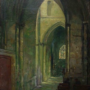
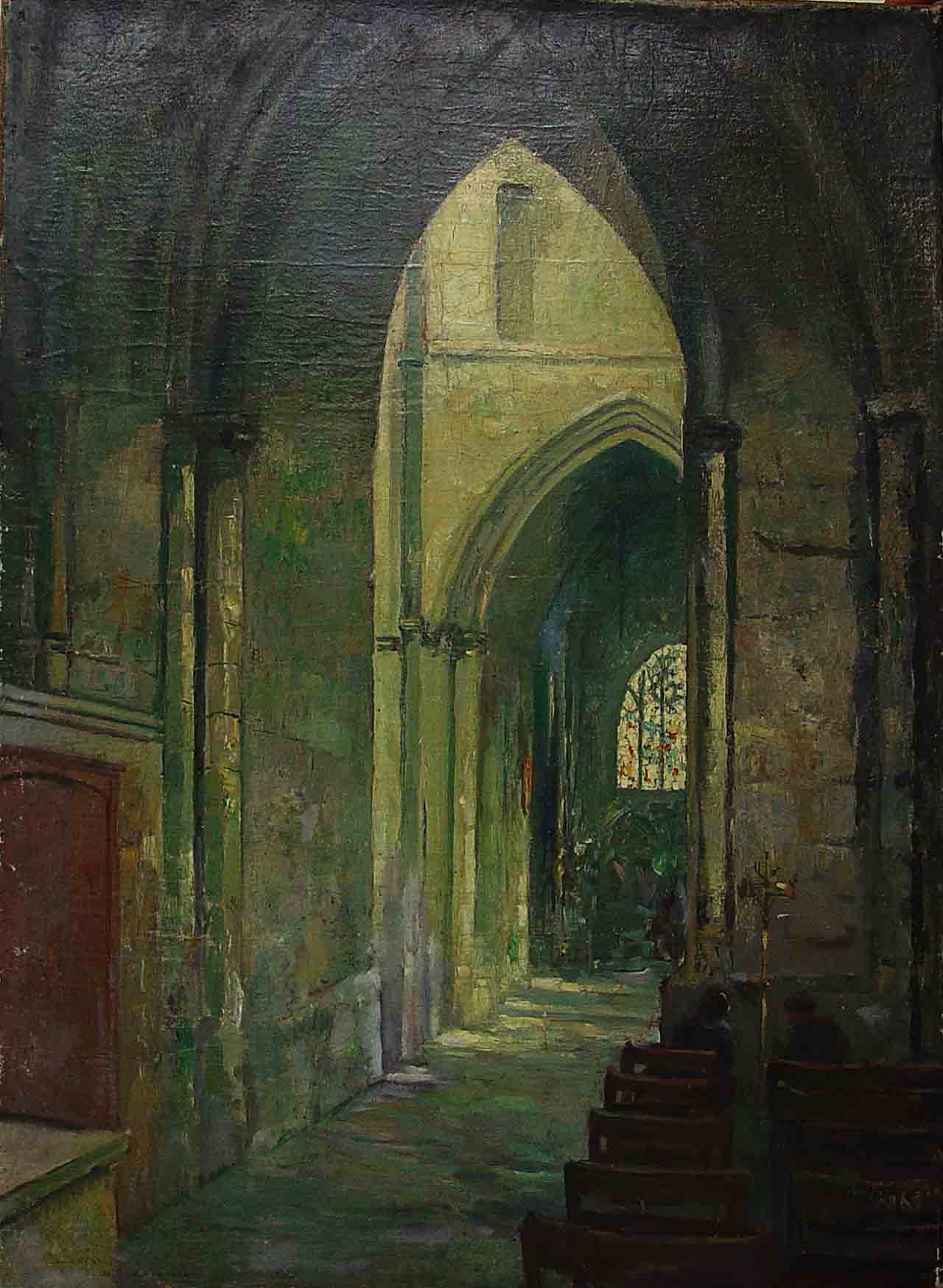
Jan Sirks explored different mediums , techniques and treatments of subject matter throughout his life in search for his personal artistic truth. His painting,drawings,pastels and etchings are a testament of his intrigue with both the outer and inner world. He was strongly influenced by the time he lived in and his work ranges from figurative expressions of the external world to explorations of the subconscious.
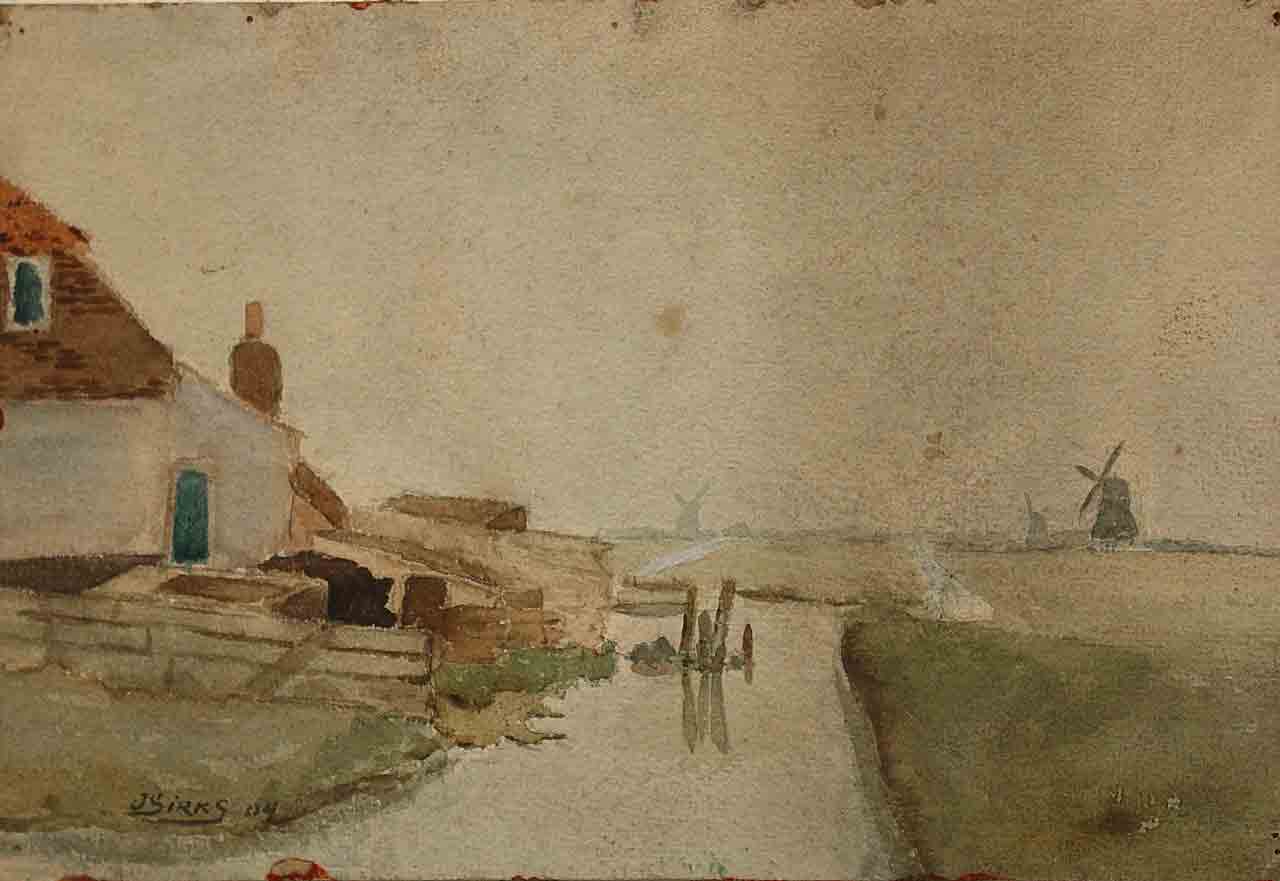
1903-1911 The Early Period Influences: The Hague School( Haagse School) Impressionism, Realism
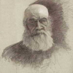
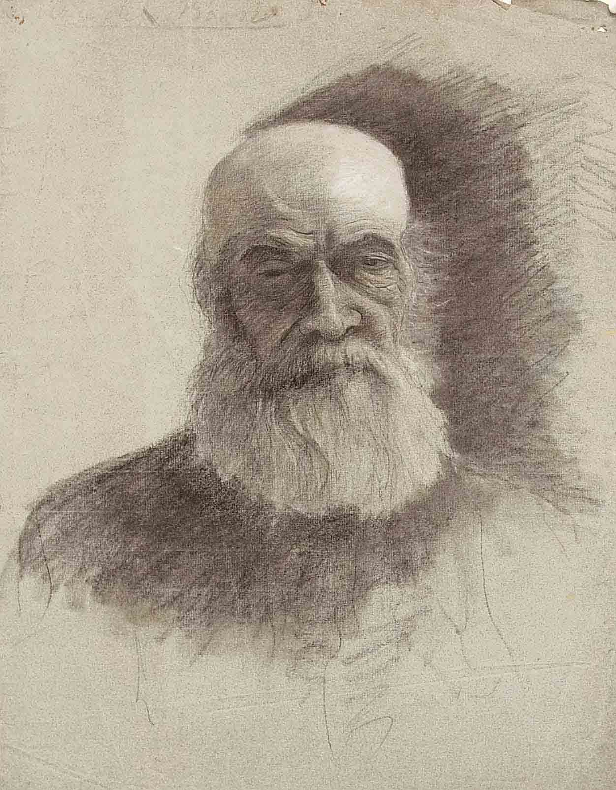
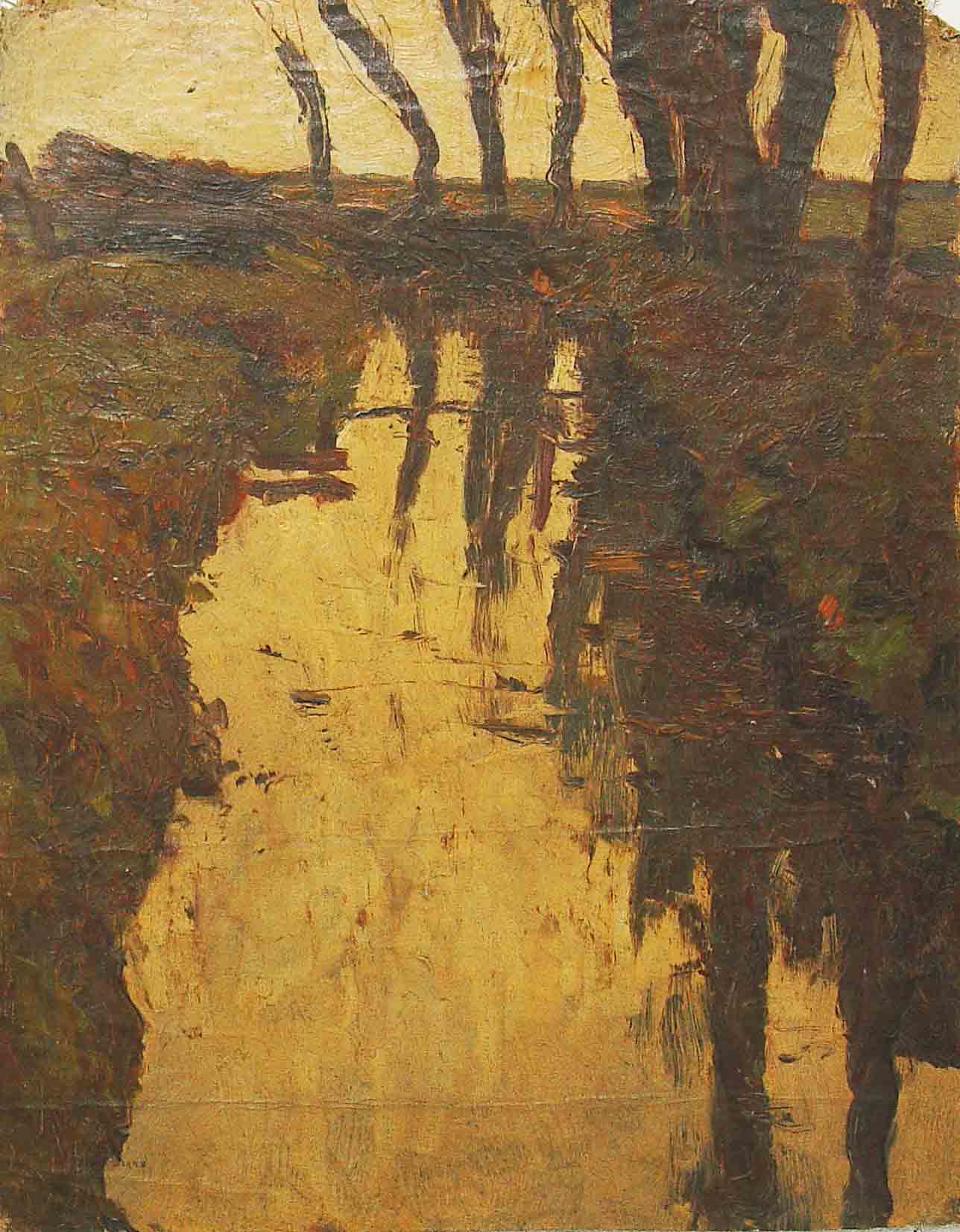
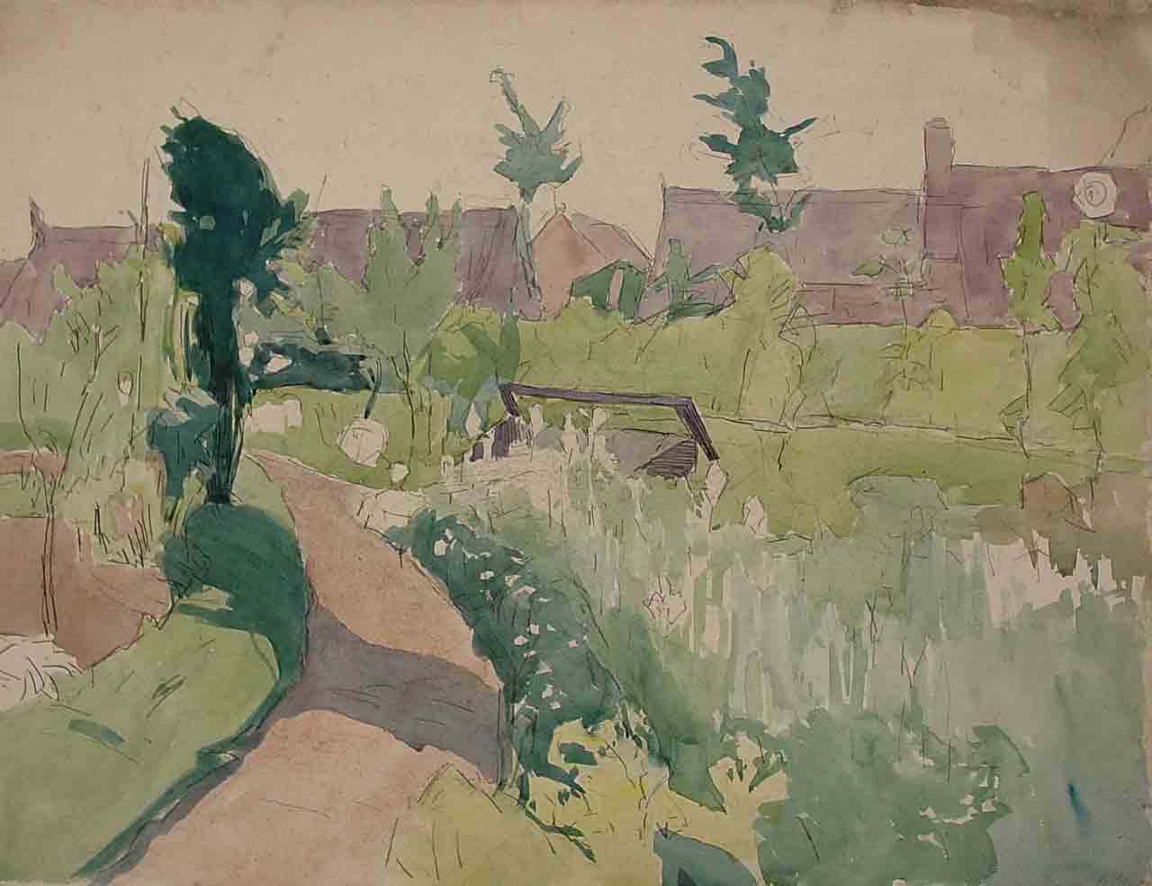
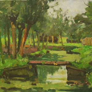
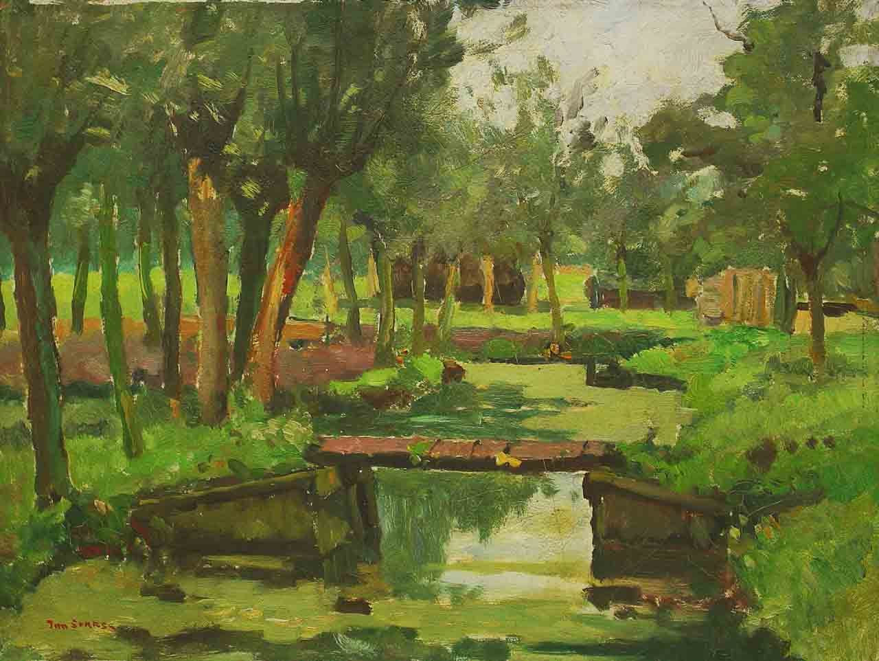
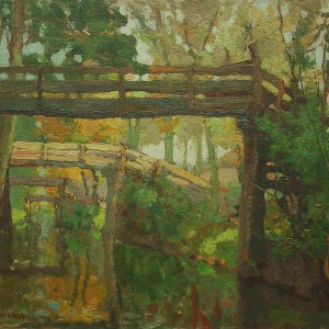
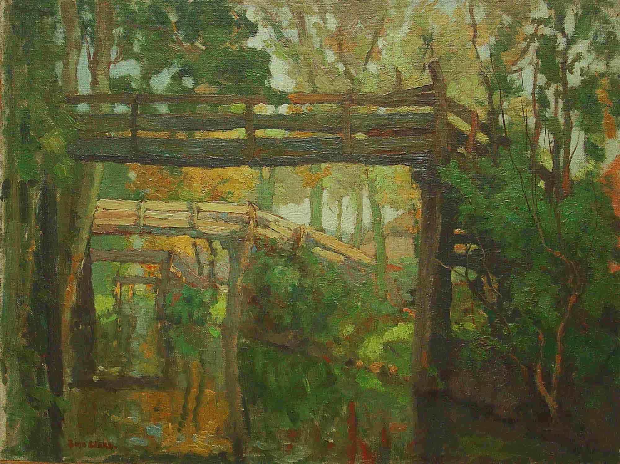
Jan Sirks created landscapes and cityscapes in watercolour and detailed portraits in pencil. The small oil paintings of the landscape around Rotterdam show an influence of The Hague School. During this phase there is a distinct stylistic change toward high contrast charcoal sketches of his exploration of the large rivers of Rotterdam. At the end of this phase Sirks develops his first etchings.
-
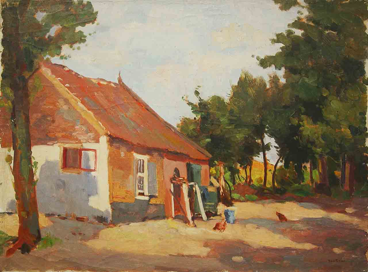
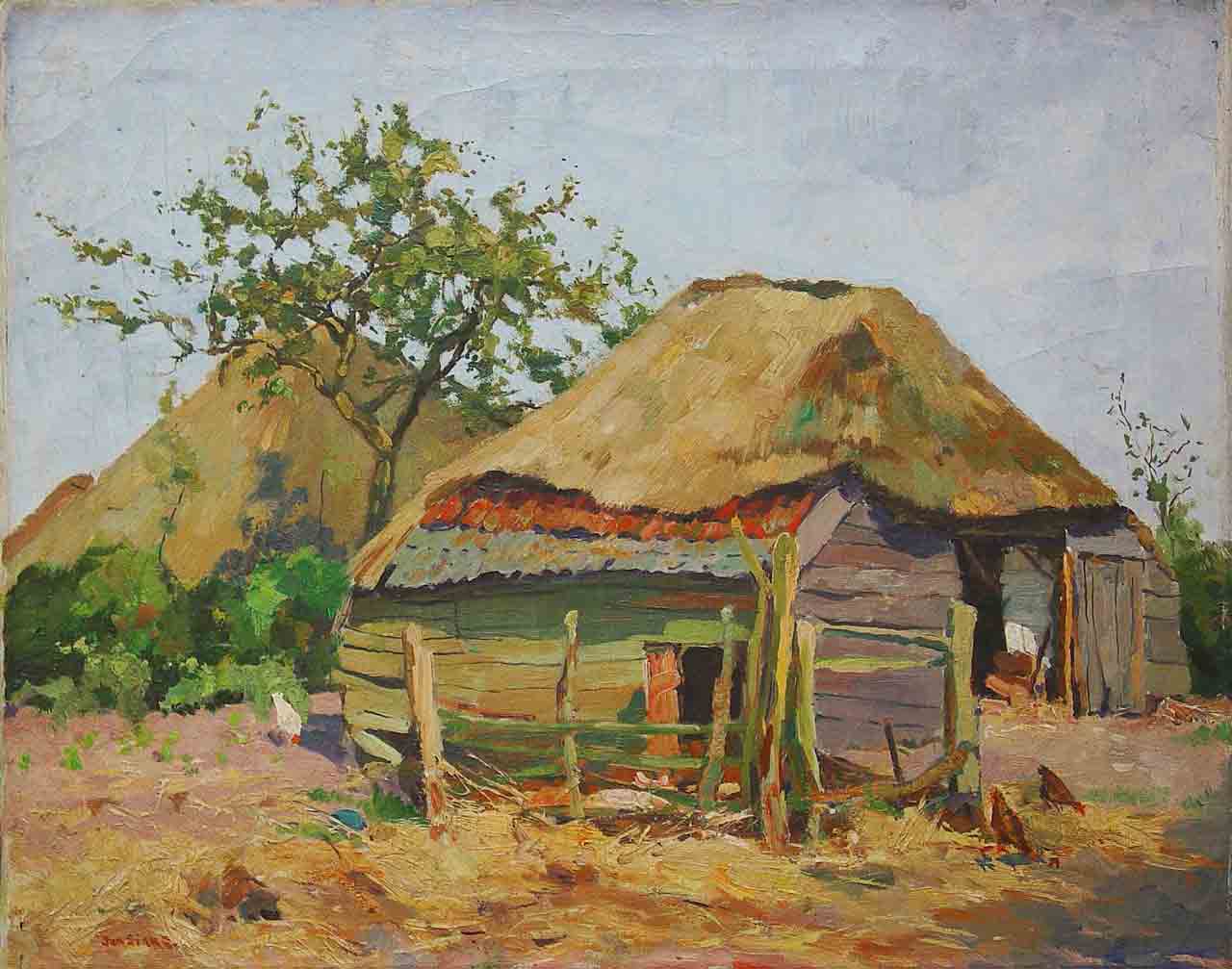
- Farm c1906 35 x 45cm.
-
- Farm early work 17 x 25 cm.
-
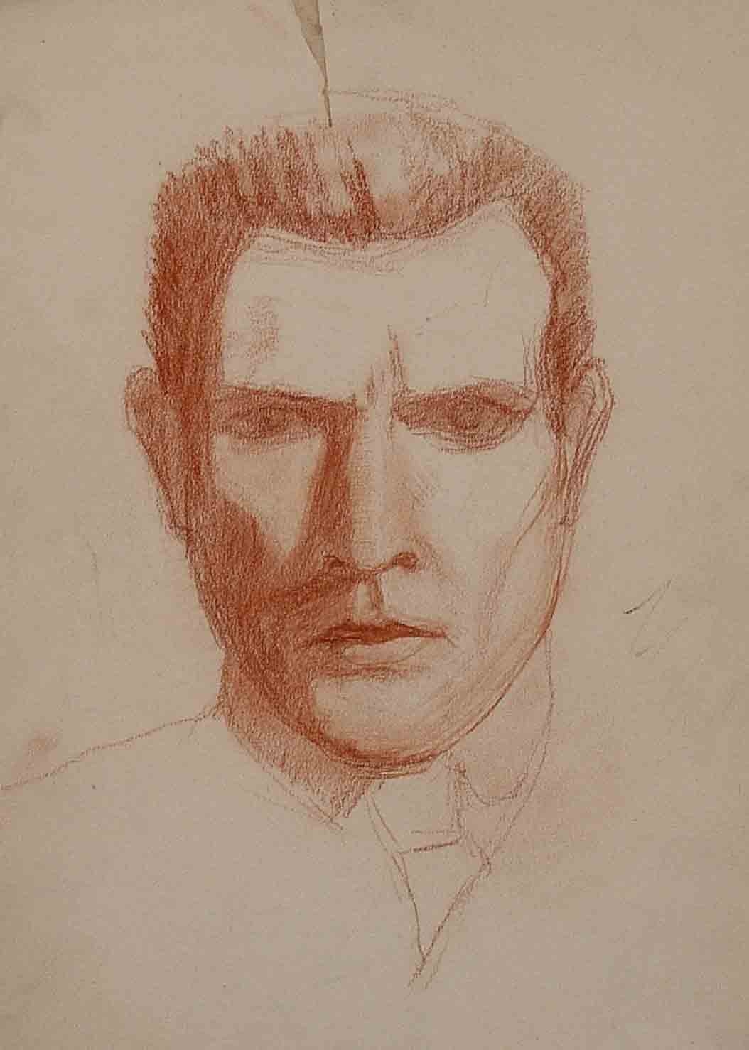
- Portrait study c1910 61 x 47 cm.
-
- Reeuwijk c1910 40 x 32.cm
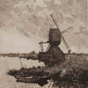
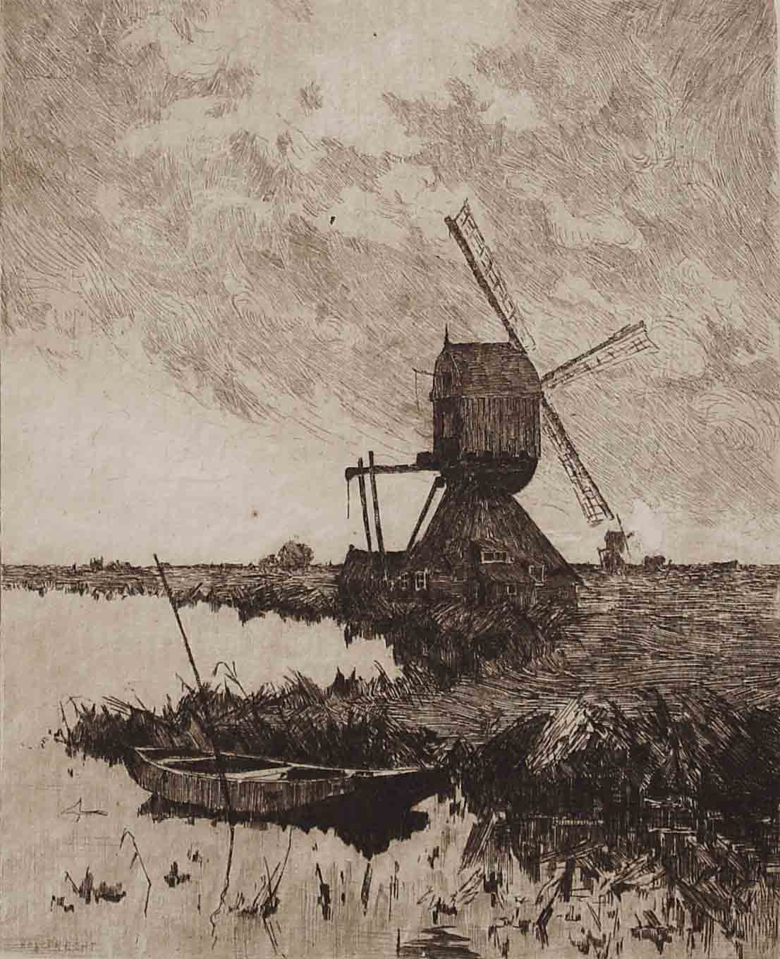
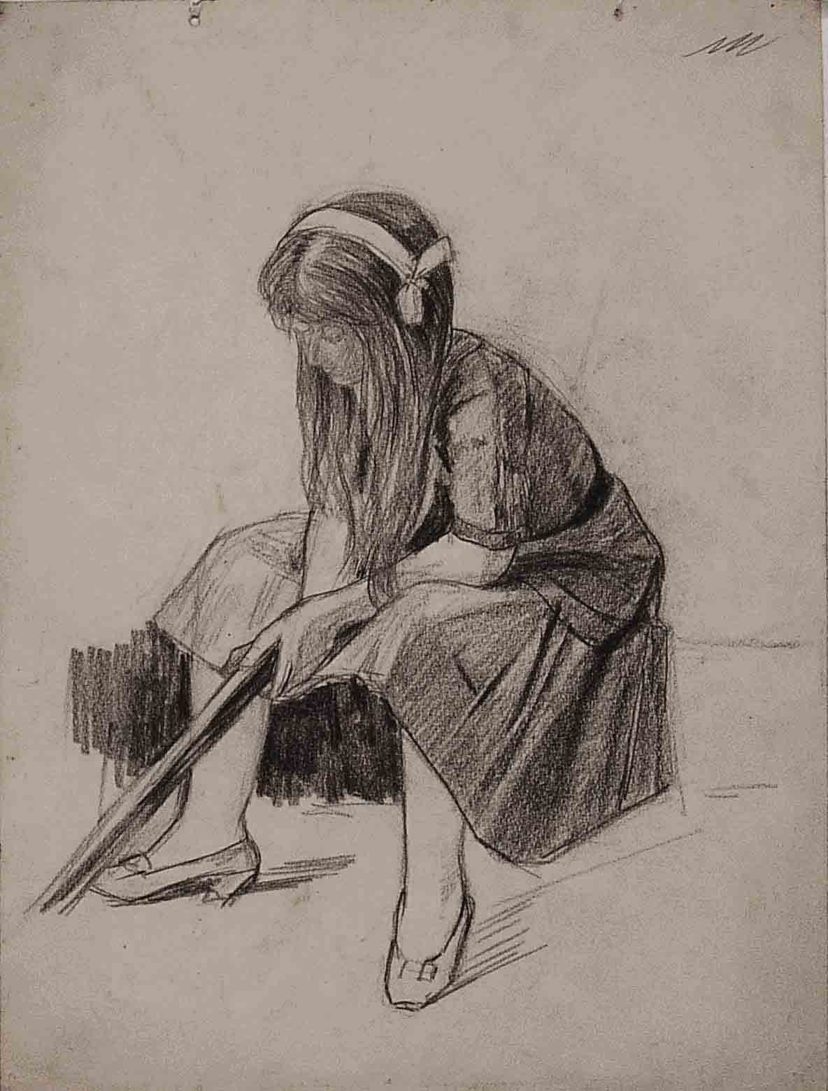
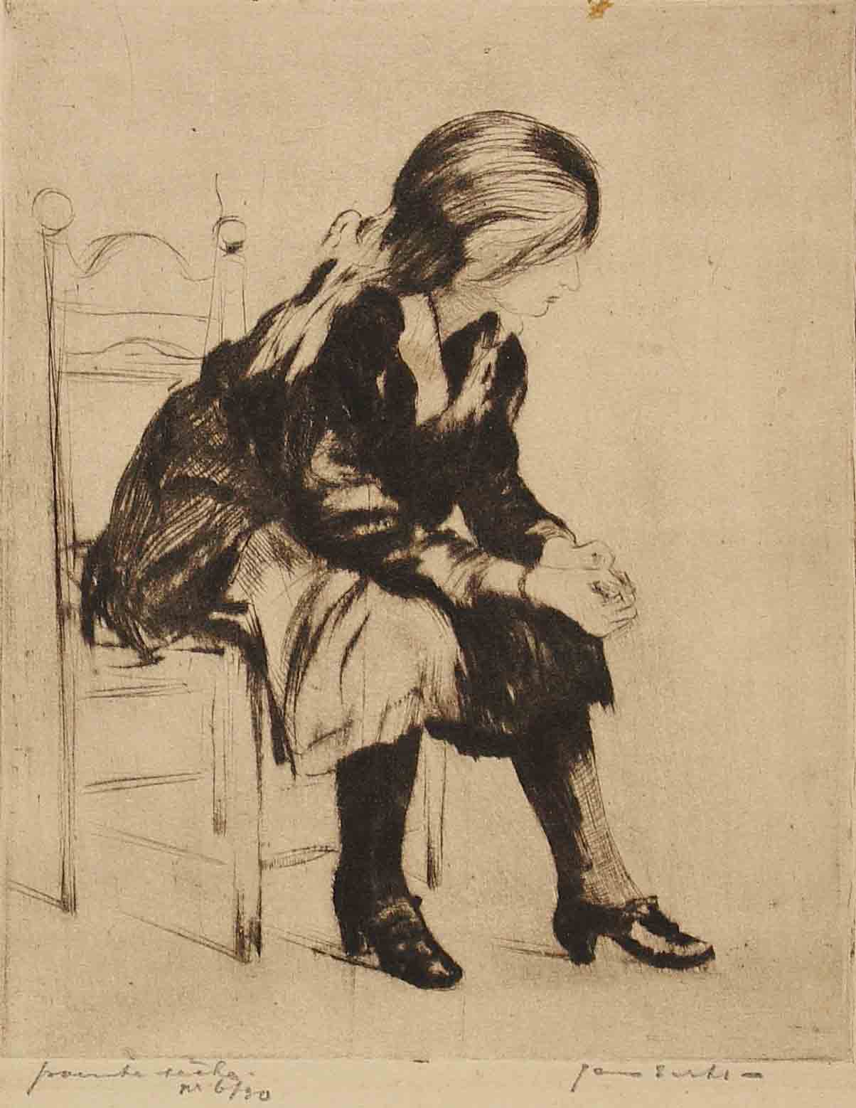
1911-1912 First Etchings and a Model
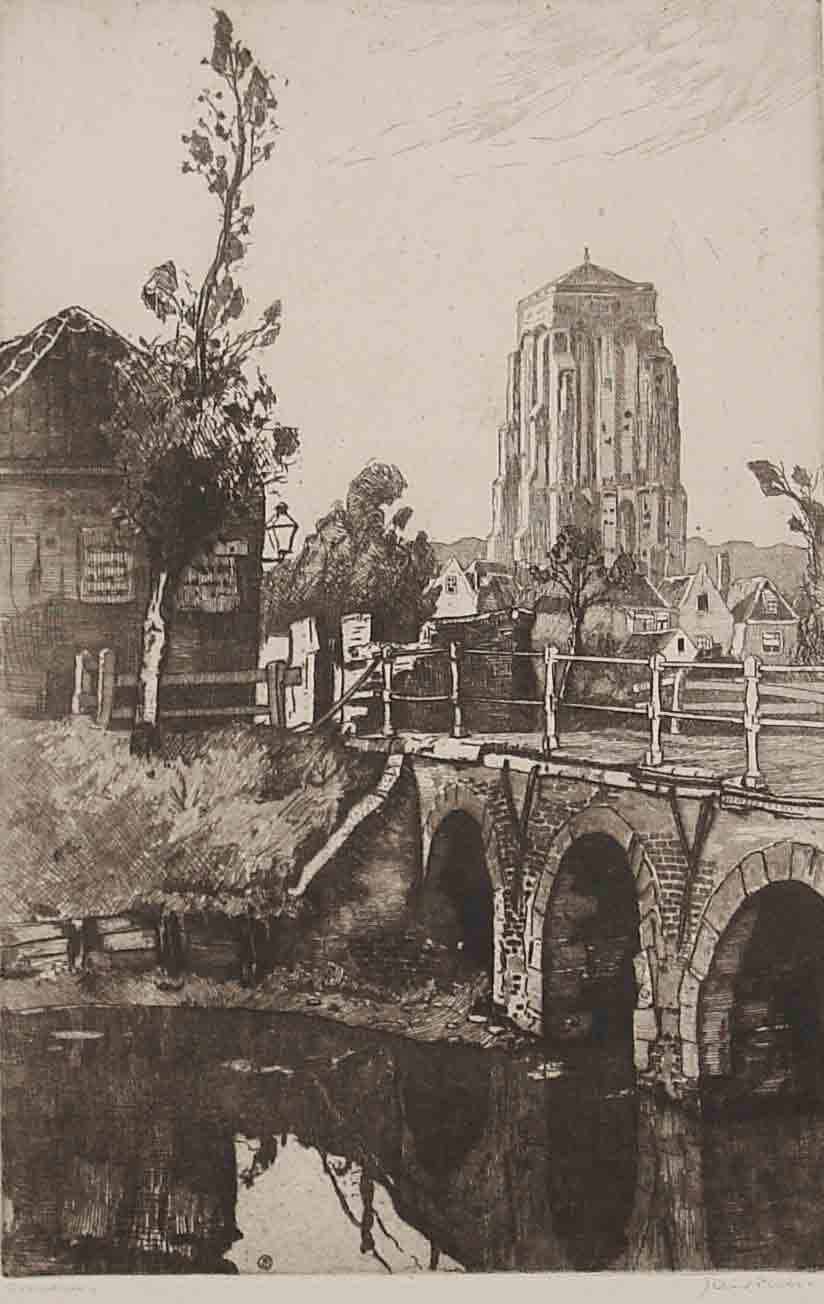
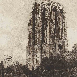
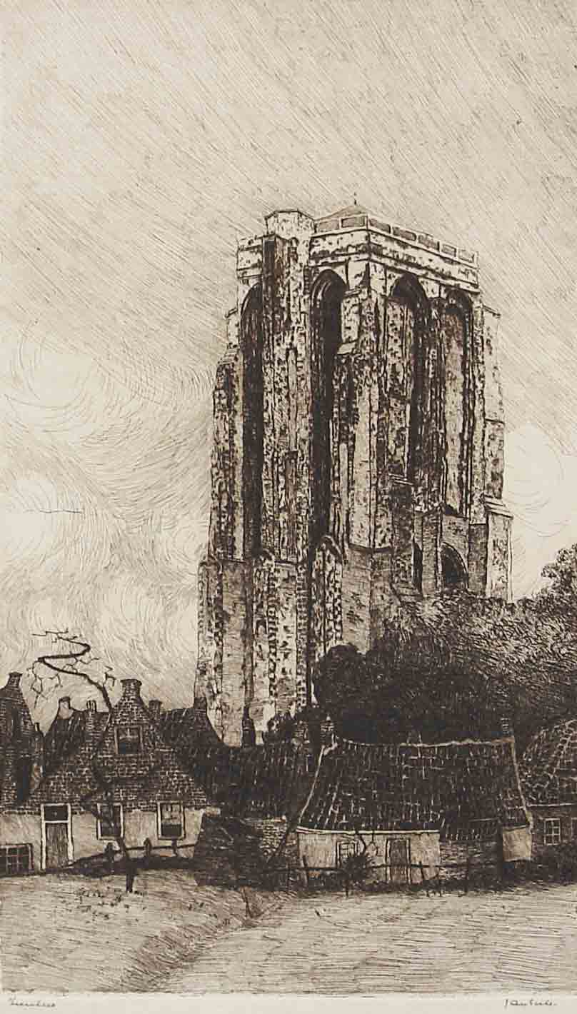
The transitional period sees a distinct change in style, medium and subject matter with the introduction of the first zinc etchings of landscapes and corners of Rotterdam that intrigue the artist. The etchings have a light tonal quality and particularly the Zierikzee Tower expresses the light conditions of the Dutch coast and shows an influence of Dutch Luminism. This period is dominated by the development of etchings and sees a great number of drawings of Jan Sirks’s model and muse Hillegonda Mol. More
-
- Haastrecht c1912 21 x 17cm.
-
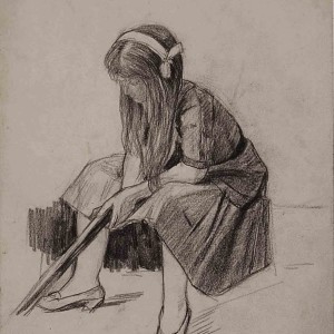
- Hillegonda 1912 40 x 30 cm.
-
- Gon 1912 29 x 37 cm.
-
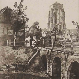
- Zierikzee 38 x 25cm.
-
- Zierikzee 38 x 25 cm.
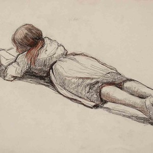
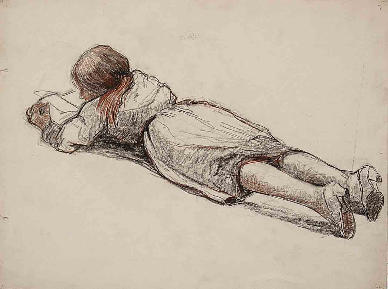
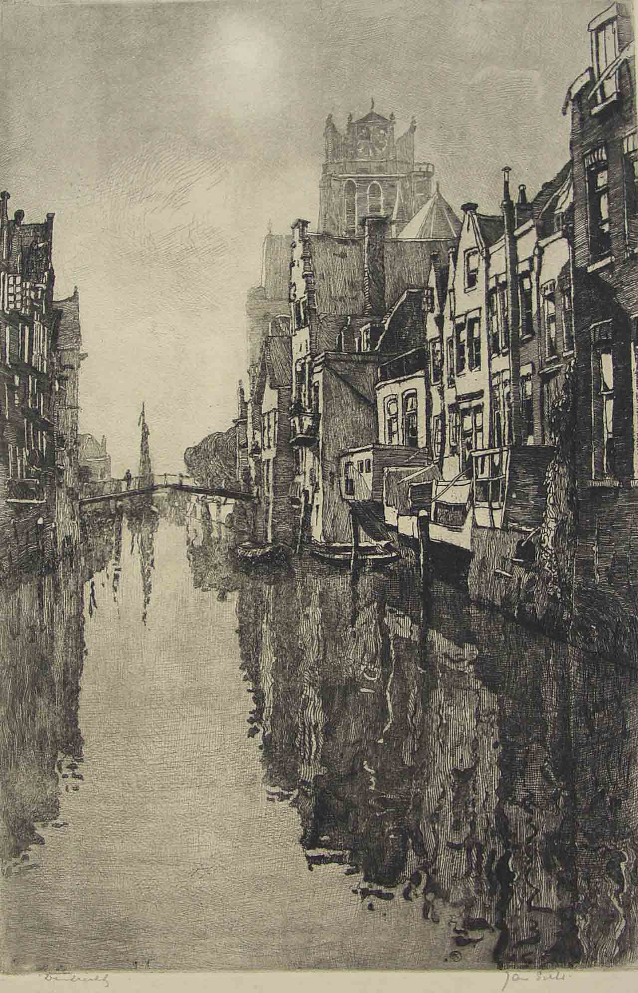
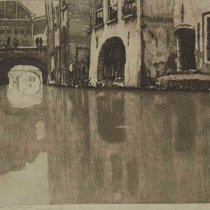
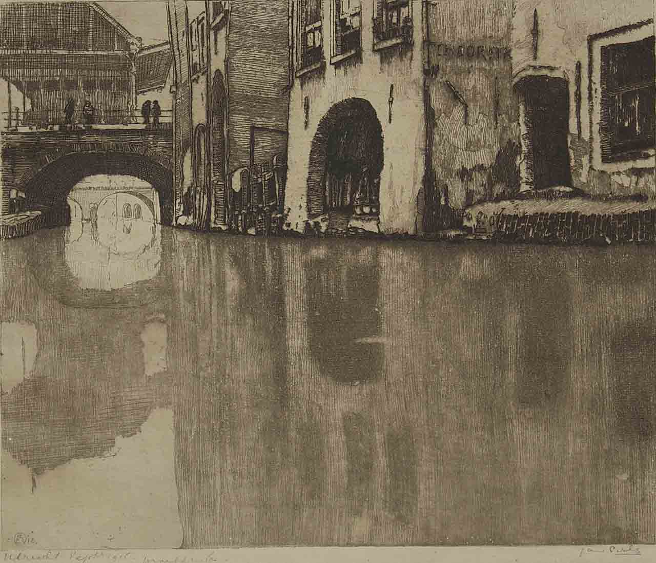
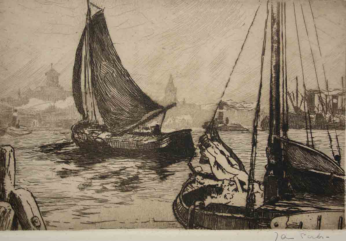
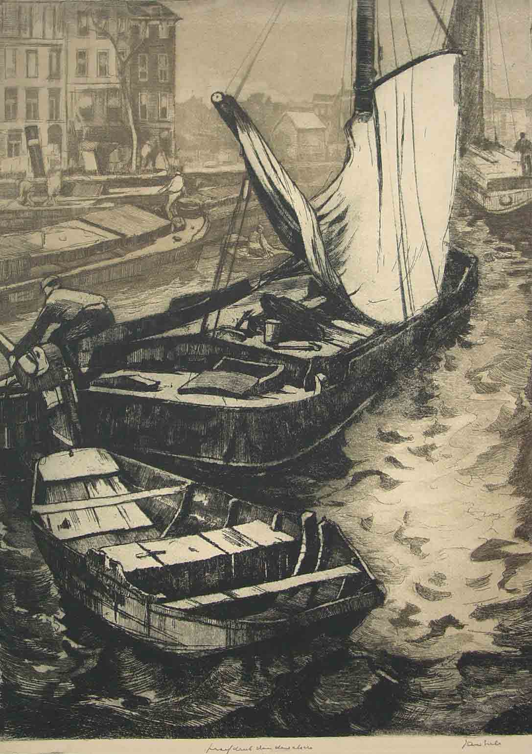
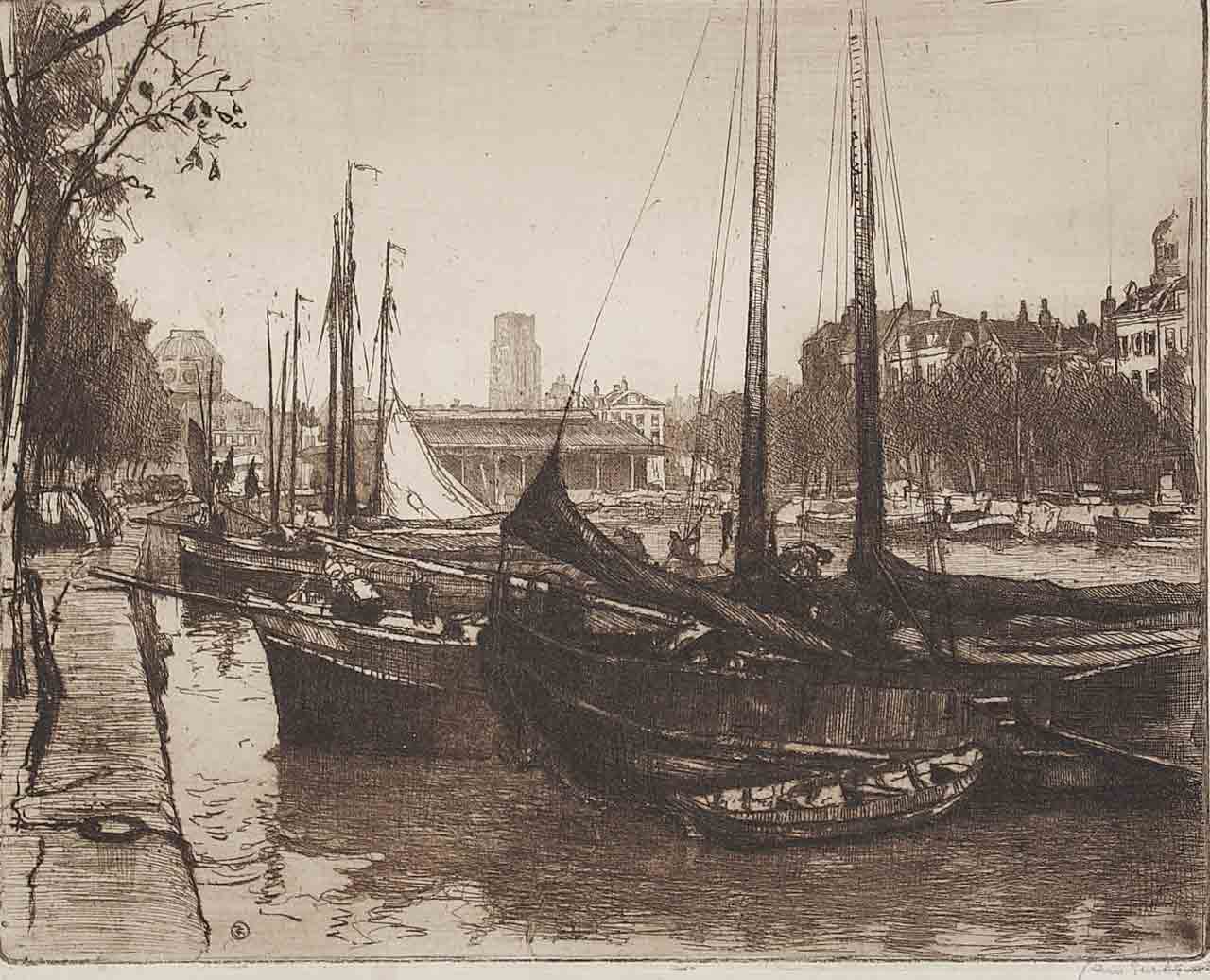
1912-1915 Etchings as a Main Medium
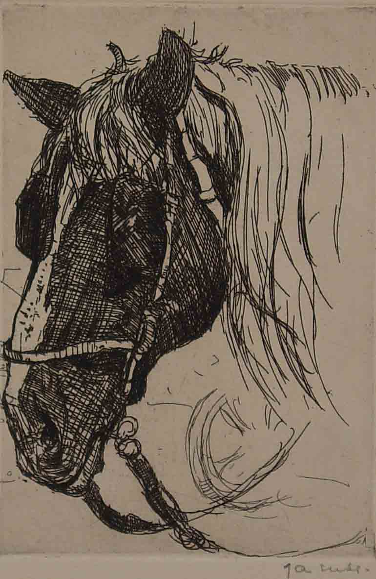
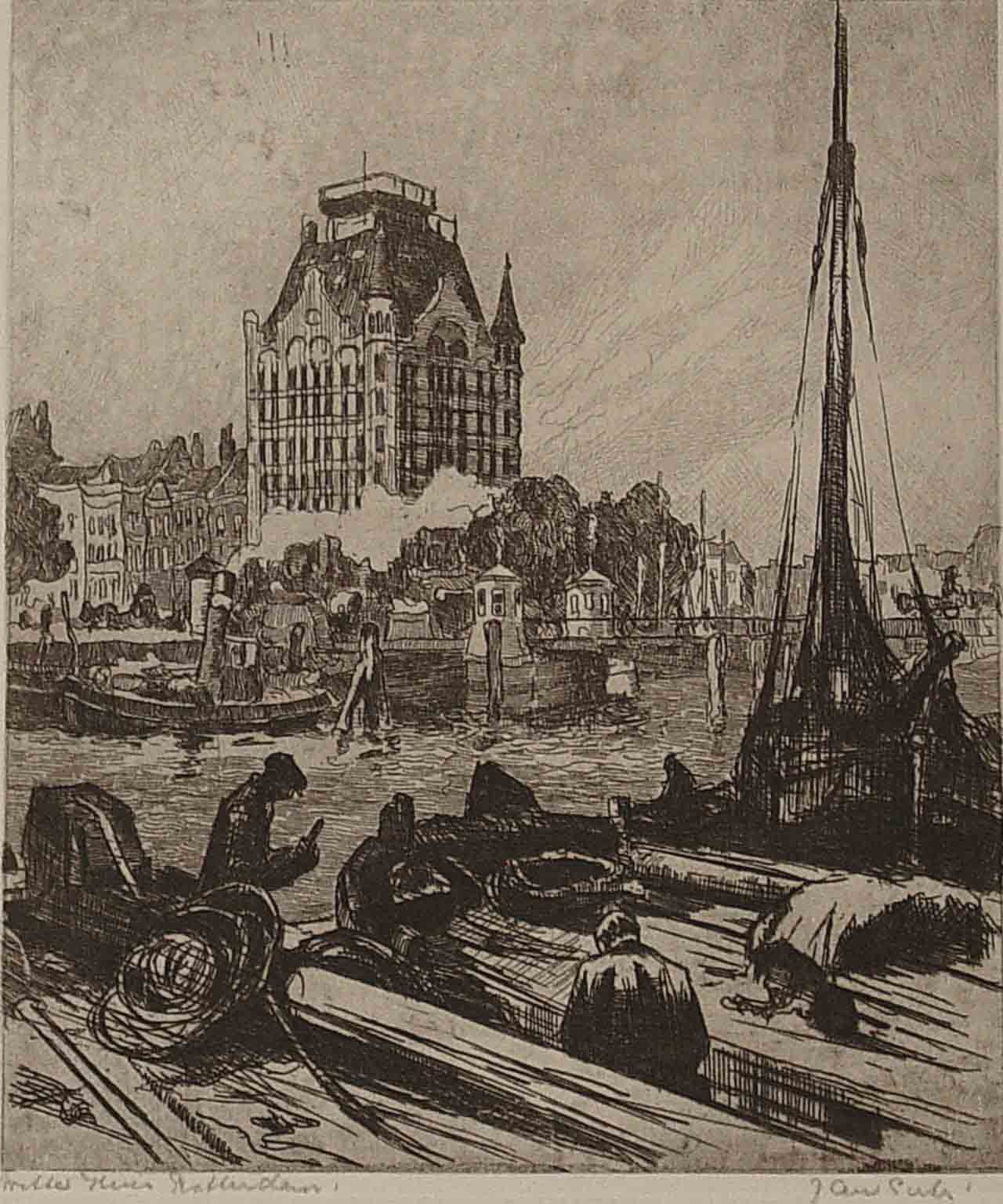
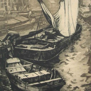
Etchings become the main medium. The artist’s choice of subject matter is now firmly focused on the water’s edge of Rotterdam’s canals, ports and rivers. The smooth and gentle impressionistic style of the early zinc etchings is suddenly transformed into an energetic turbulence of waves and movement (River Scene Rotterdam 1913) The etchings grow increasingly more detailed and as Sirks develops his ability to master the medium, he develops a painterly style that is highly evident in the workhorses he captures in zinc. There are a large number of drawings and watercolours of his model as well as some etchings. These works capture the model’s characteristic poses as opposed to the more formal studies that were the custom of that period.
Contacts: Bernard Canter, Theo van Doesburg, Henri le Fauconnier,Piet Mondriaan, Bernard Toon Gits,Herman Bieling
-
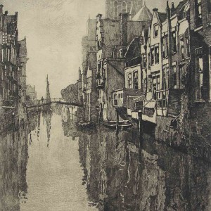
- Dordrecht Inner Harbour 1912 38 x 25 cm.
-
- Utrecht Old Canal 1915 18 x 21 cm.
-
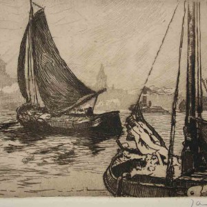
- Rotterdam Sailing Barge 1913 12 x 19 cm.
-
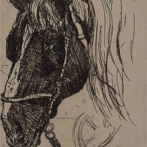
- Workhorse 3 Etching c 1915 14 x 10 cm.
-
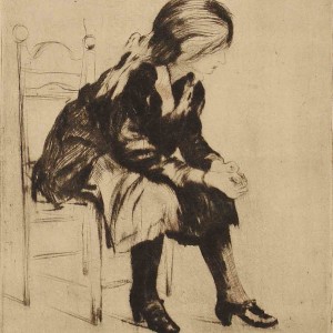
- Gon 1912 19 x 15 cm.
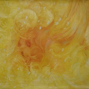
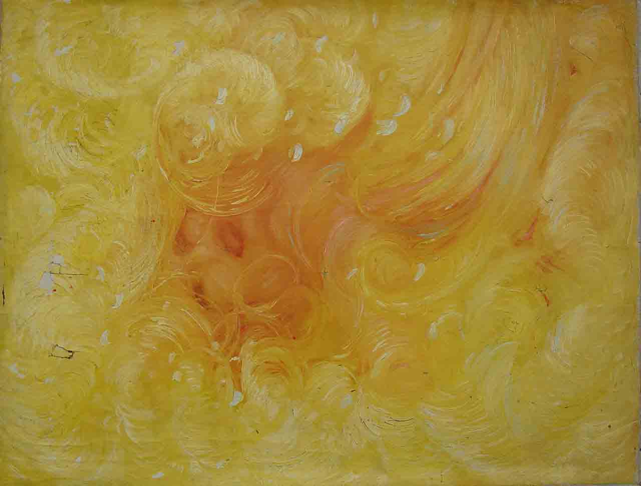
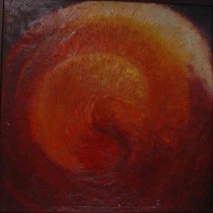
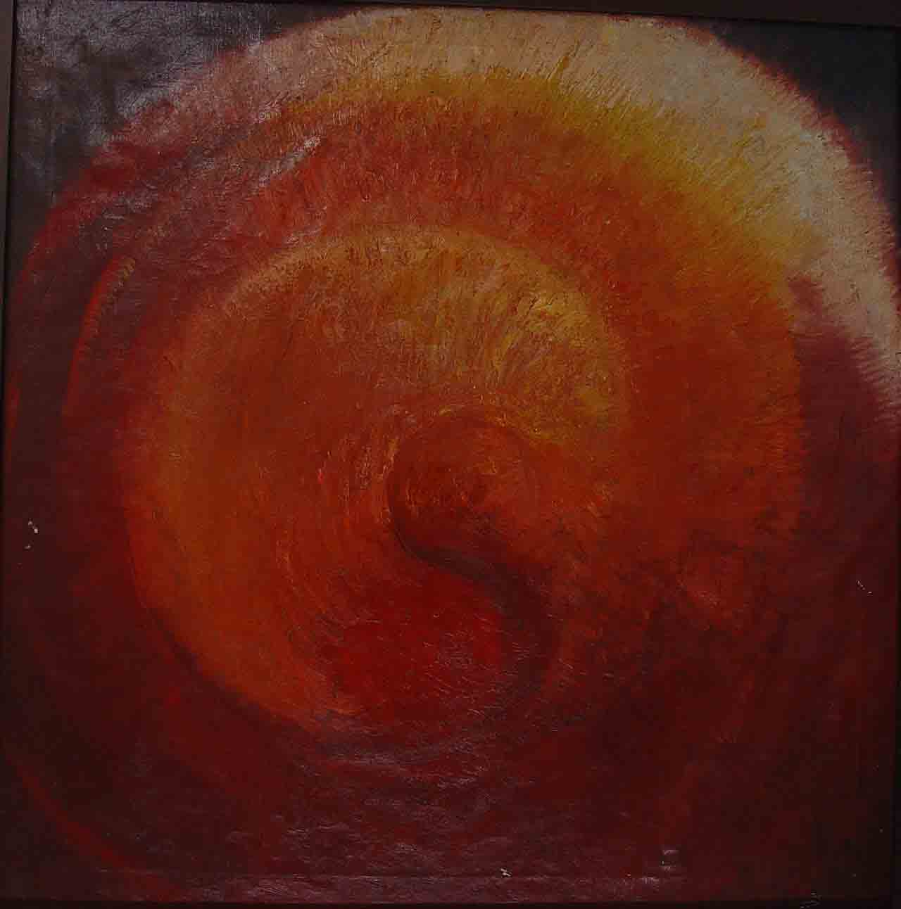
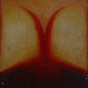
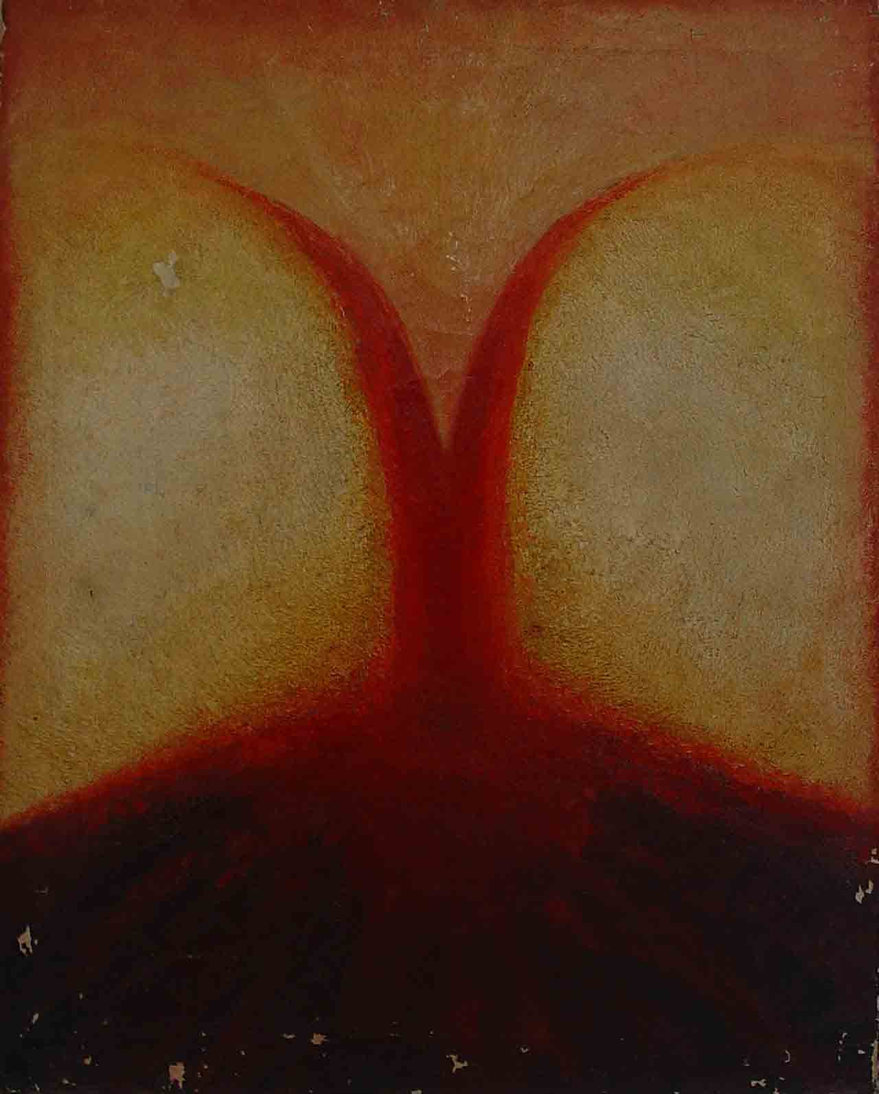
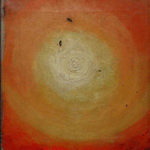
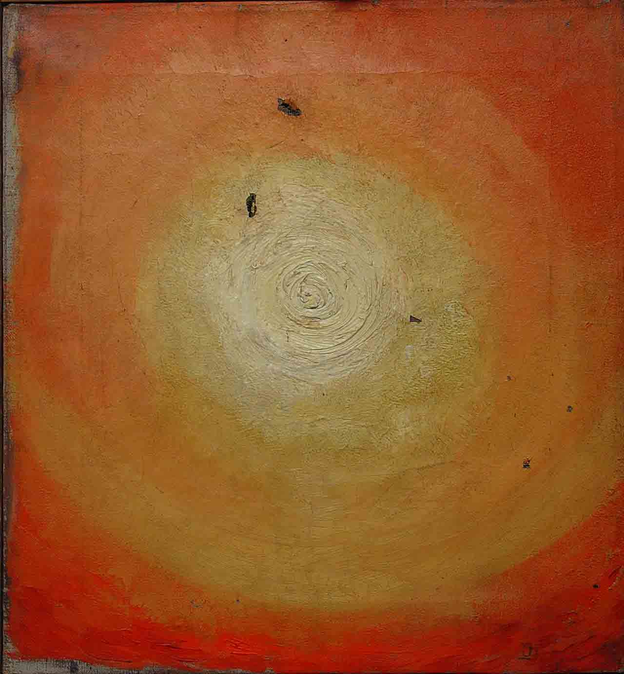
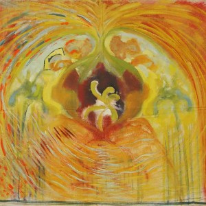
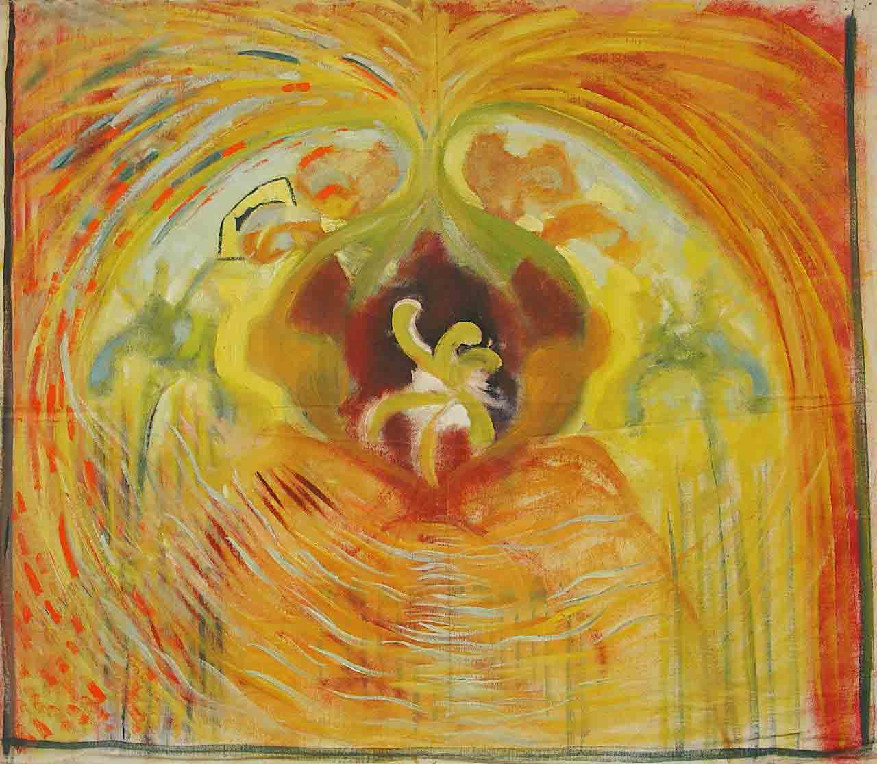
1916-1917 Esoteric Phase
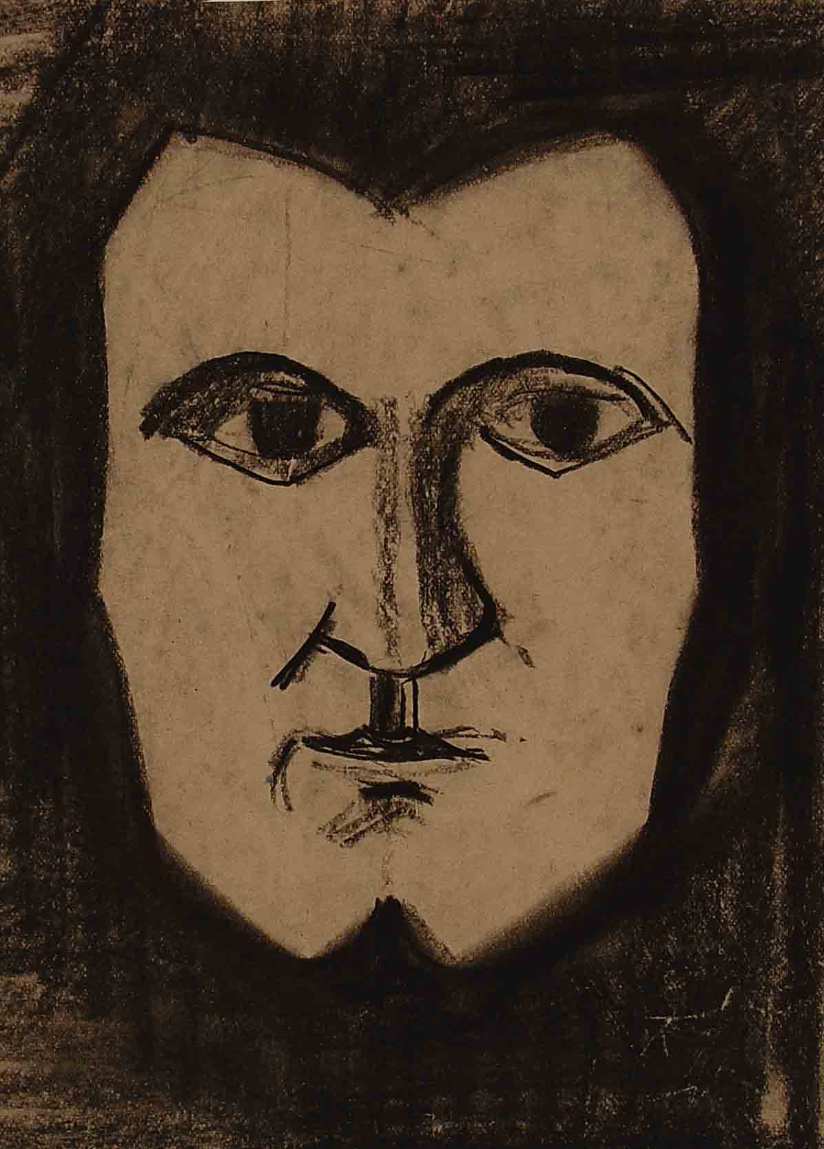
This phase marks the time where the artistic output splits into two. Sirks’s portrays not only the world around him but also his subconscious. Sirks begins to meditate and commits his inner visions to canvas and introduces pastel. The titles Sirks gives these works are indicative of their significance on a personal level. (Growth, Strife, Outing 1916, Ascension).
-
- Vision Painting 1917 67 x 89 cm.
-
- Vision 2 Painting 74 x 73 cm.
-
- Awakening Painting 79 x 64 cm.
-
- Outing June Painting 1917 38 x 35 cm.
-
- Energy Painting 1916 62 x 57 cm.
1918-1919 Portrait Series and the Surf (De Branding) Influences: Bergen School, German Impressionism, Dutch Luminisme
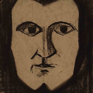
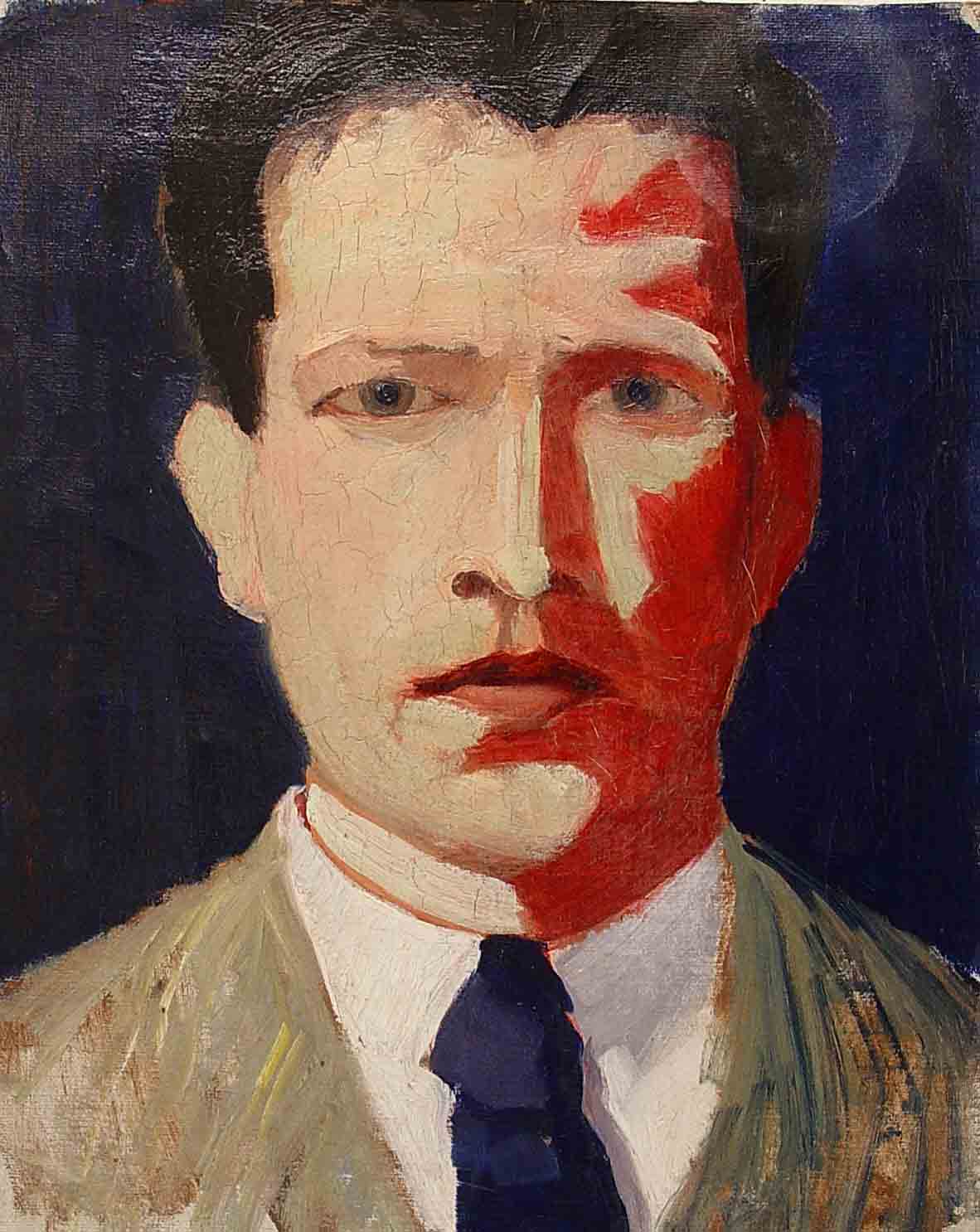
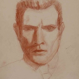
Jan Sirks is fascinated by Kandinsky’s colour theory and links colour to his personal emotions. This post-war period is marked by an increasingly diverse range of techniques and treatment of subject matter and marks the end of the painting of inner visions. It begins with a series of portraits that are created just after the war ended. The abstracted palette is smooth and colour is used to express emotions with a focus on blue and red. It is the only time Sirks paints self-portraits and they mark a transition between the esoteric phase and the phase during which Sirks abstracts colour as an expression of emotion in his landscapes. During this post-war phase Sirks masters the unforgiving copper and creates his first large scale etchings of Rotterdam’s inner harbours and busy port scenes. (Rotterdam 1918).The phase foreshadows the expressive exuberance of the 1922-1925 period.
Contacts:Bernard Canter, Pieter den Besten,H.F.Boot,Jan Toorop,Johannes Tielemans
-
- Self portrait charcoal 1918 21 x 15 cm.
-
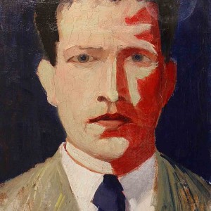
- Self portrait c 1918 35 x 28 cm.
-
- Self portrait c1918 39 x 30 cm.
1921 Tonal Contrast
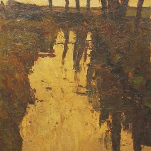
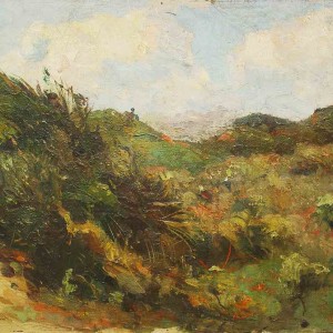
During this phase the initially multi-coloured palette becomes dominated by green and is opposed by a sunlit muted orange in the paintings and by green and purple in the watercolours of this phase. Sirks uses colour and form to express meaning.
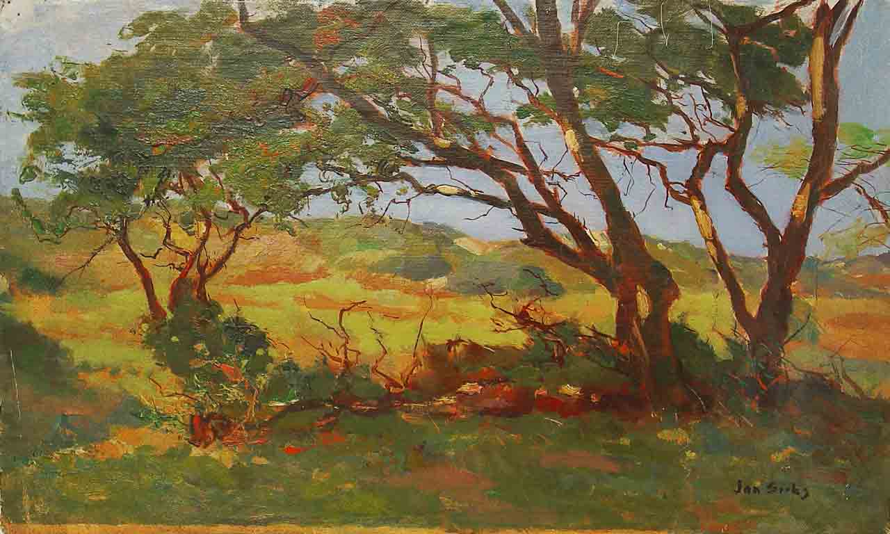
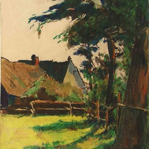
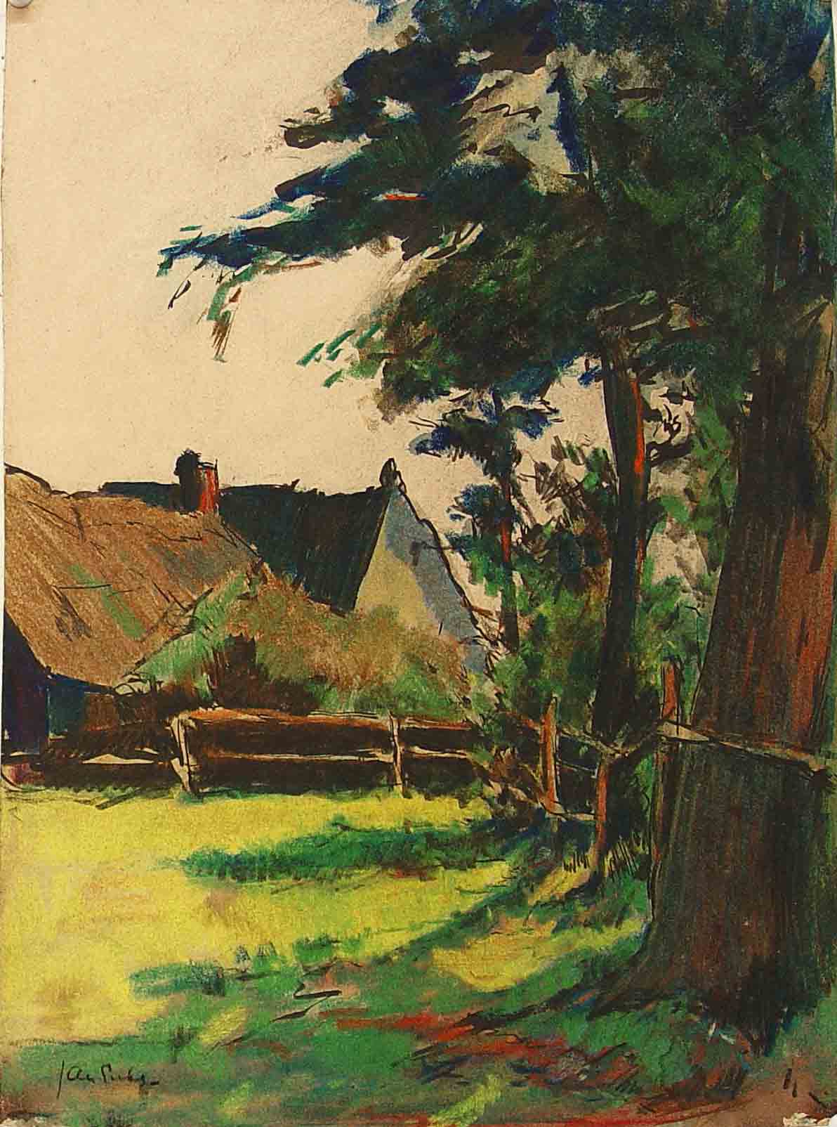
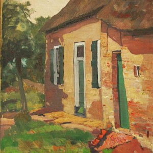
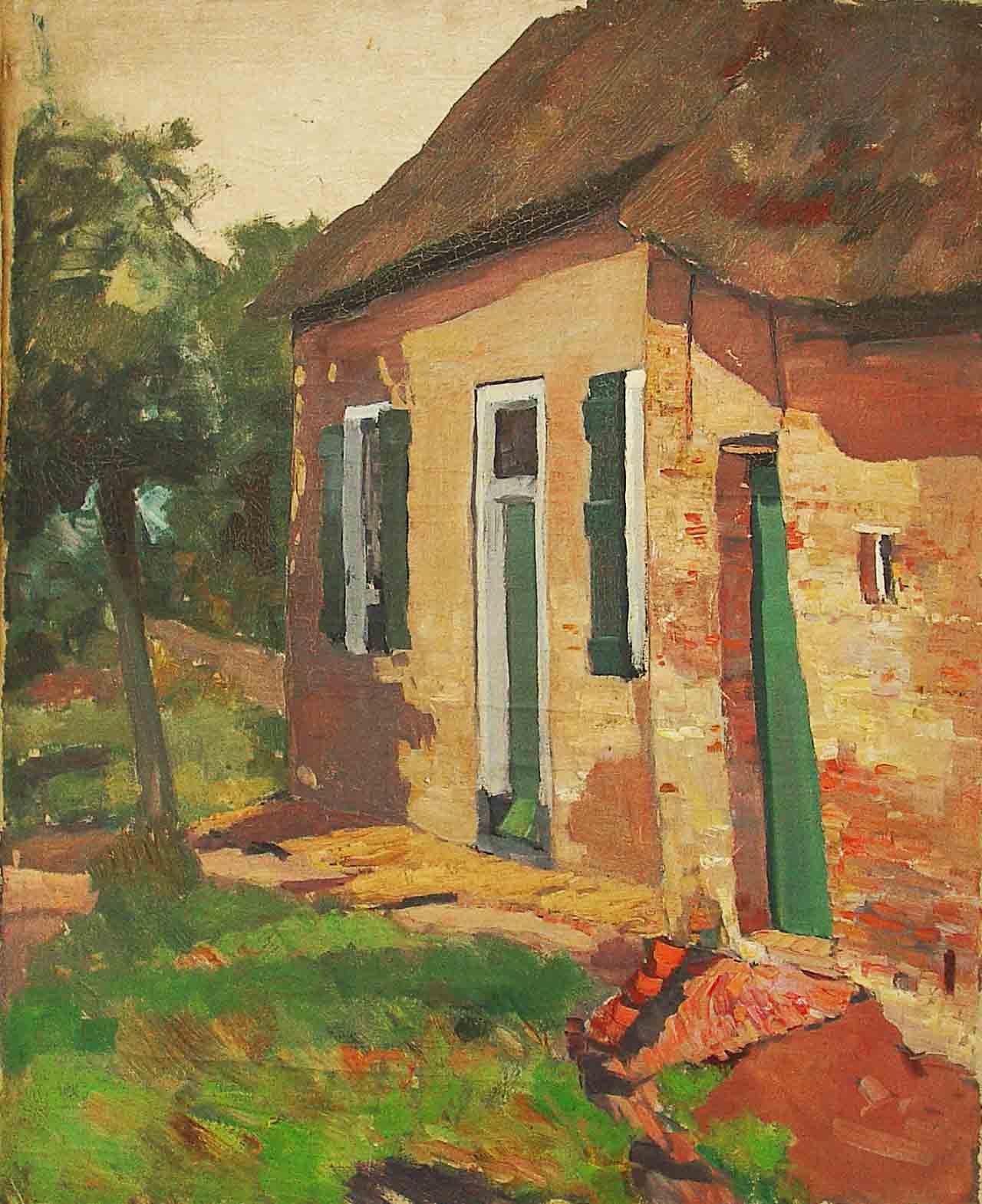
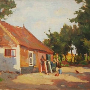
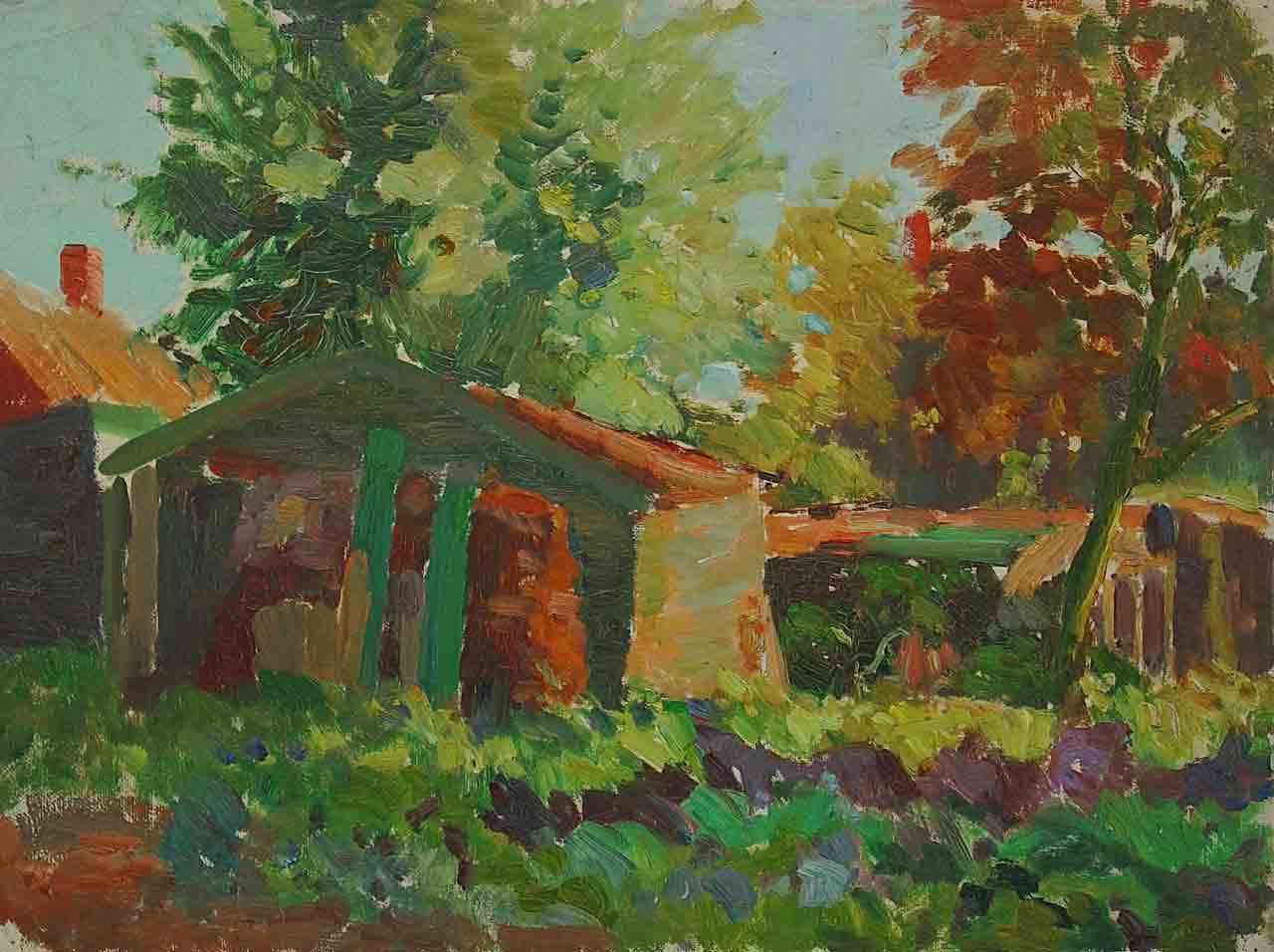
Sirks travels to Bergen, Noorden ,Zeeland and Germany where he works on location. He returns to the subject matter of his early years, the farm, and creates a series of brightly lit farm landscapes both in oil and water colour. These works are eveident of a stylistic change in their pre-occupation with the influence of light and the effect of a limited palette. They are a clear move away from the more somber palette of the artist’s earlier years. The canvasses of this time are bathed in sunlight and foretell the later high tonal contrast.
The larger copper etchings foreshadow the influence of japanese woodcuts in their treatment of perspective. There is increased tonal contrast in the etchings with the introduction of multi-directional lines. The industrial images of the large harbor are introduced as themes and the viewer is no longer in the distance but at the very edge of the action. (Rotterdam 1921)
Sirks introduces animals to his subject matter. Visits to the Rotterdam zoo (De Rotterdamse Diergaarde) yield a series of etchings of lions,tigers,pelicans and maraboes as well as colourful, decorative woodcuts of kakatoes.
Contacts: Isaac Israels, Cornelis Vreedenburgh and Max Liebermann.
-
- farm study pastel c 1922 40 x 29 cm.
-
- Farm study c 1921 51 x 69 cm.
-
- Study farm landscape 79 x 66 cm.
-
- Farm in Vuursche 49 x 63.cm
-
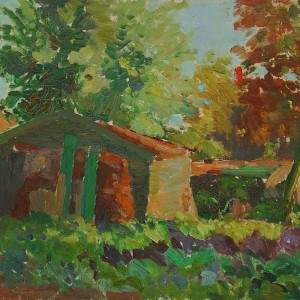
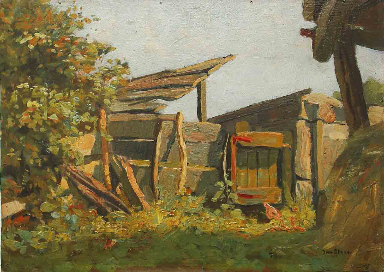
- Farm with hay shed 1921 30 x 40 cm.
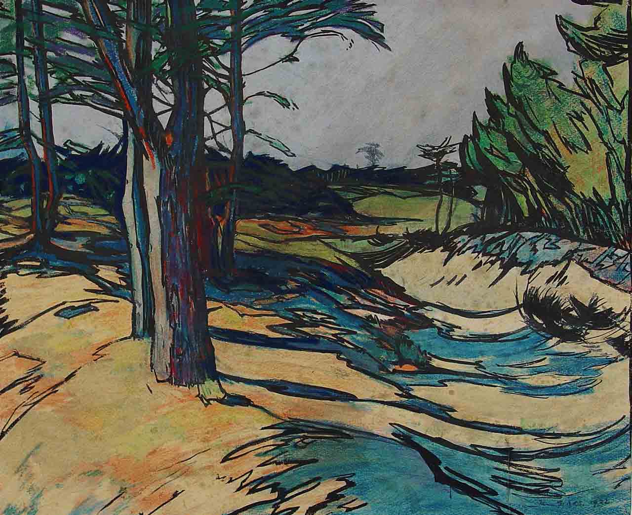
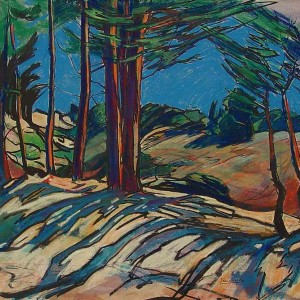
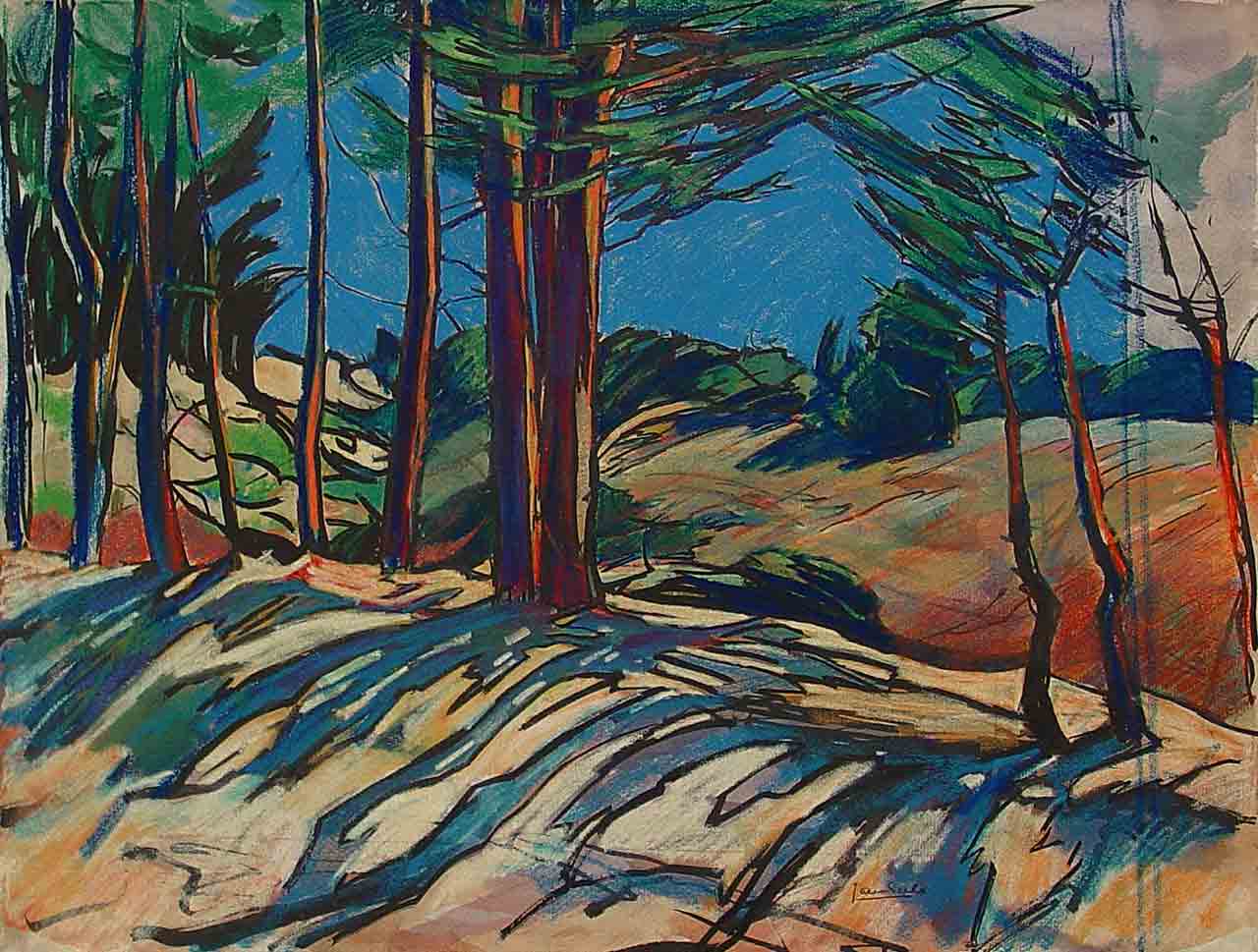
1922-1925 Tonal Contrast
Influences: Japonisme, Expressionism,Colour Theory
A new treatment of colour, form and perspective is evident in this phase where subject matter and colour gain an equal footing. The use of colour is symbolic.
In the Brabant series Sirks communicates his new landscape. His inner emotion is conveyed through a vibrant abstracted palette dominated by blue, yellow and orange. The tree takes center-stage and the high horizon and up tilted foreground is indicative of his exposure to the Japanese woodcuts of Hiroshige.
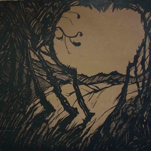
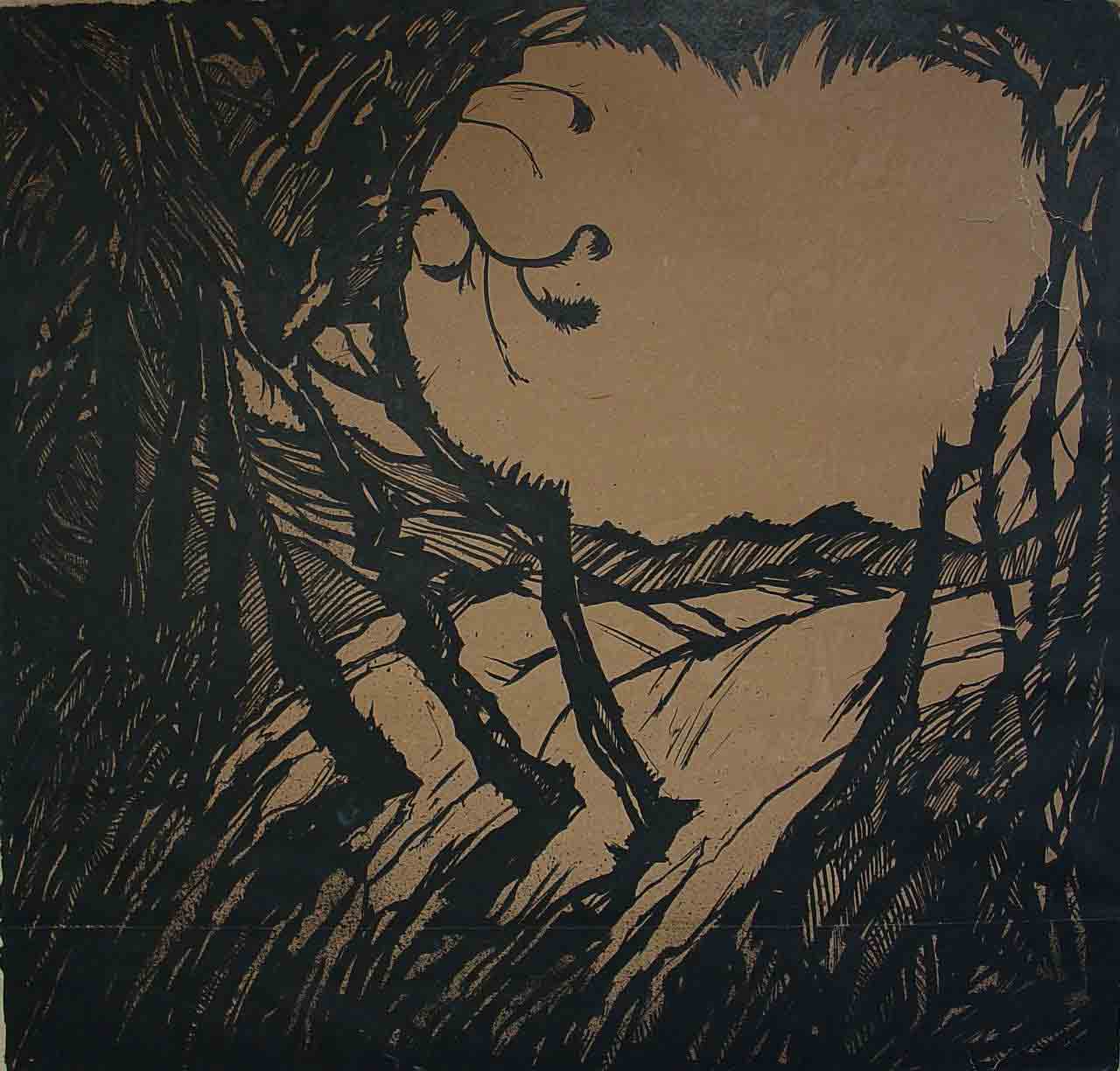
A series of ink works called “Vegetation” portrays dark and dense landscapes of abstracted trees. Japonisme is evident in the up tilted foreground and pen stroke but the high horizon is replaced by a birds-eye vista that takes the viewer’s eye to a horizon of highly stylized trees.
This change in treatment of the subject matter is also evident in the etchings of this time. Although they remain representational, the horizon is moved up and the foreground is often up- tilted. There are hints of multiple moments that represent his fascination with time and motion. Some critics have described these as errors in perspective.
During this period Sirks creates around twenty colour etchings.
The Brittany Coastal paintings culminate this stylistic phase with solidly anchored forms and a return to a smoother palette with a predominant purple hue. The up tilted foreground is still evident and the viewer finds himself drawn looking down into the scene.
-
- Pastel landscape 1922 44 x 54 cm.
-
- Trees 1922 51 x 64 cm.
-
- Trees ink drawing 1922 77 x 79cm.
-
- Rotterdam White House 17 x 15 cm.
-
- Rotterdam Bolwerk 45 x 31 cm
1926-1928 A Change of Palette
The ongoing focus on colour is evident in the 1926 series of Giethoorn where Jan worked for a number of weeks in the autumn of 1926. His increasingly limited palette reflects the autumnal colours of this “Venice of the Netherlands” and a vibrantly illuminated green dominates. Sirks’s conveys the peaceful quality of nature and the energy of palette is enhanced by multi-toned and multi-directional brushstroke.
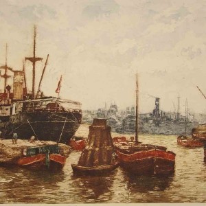
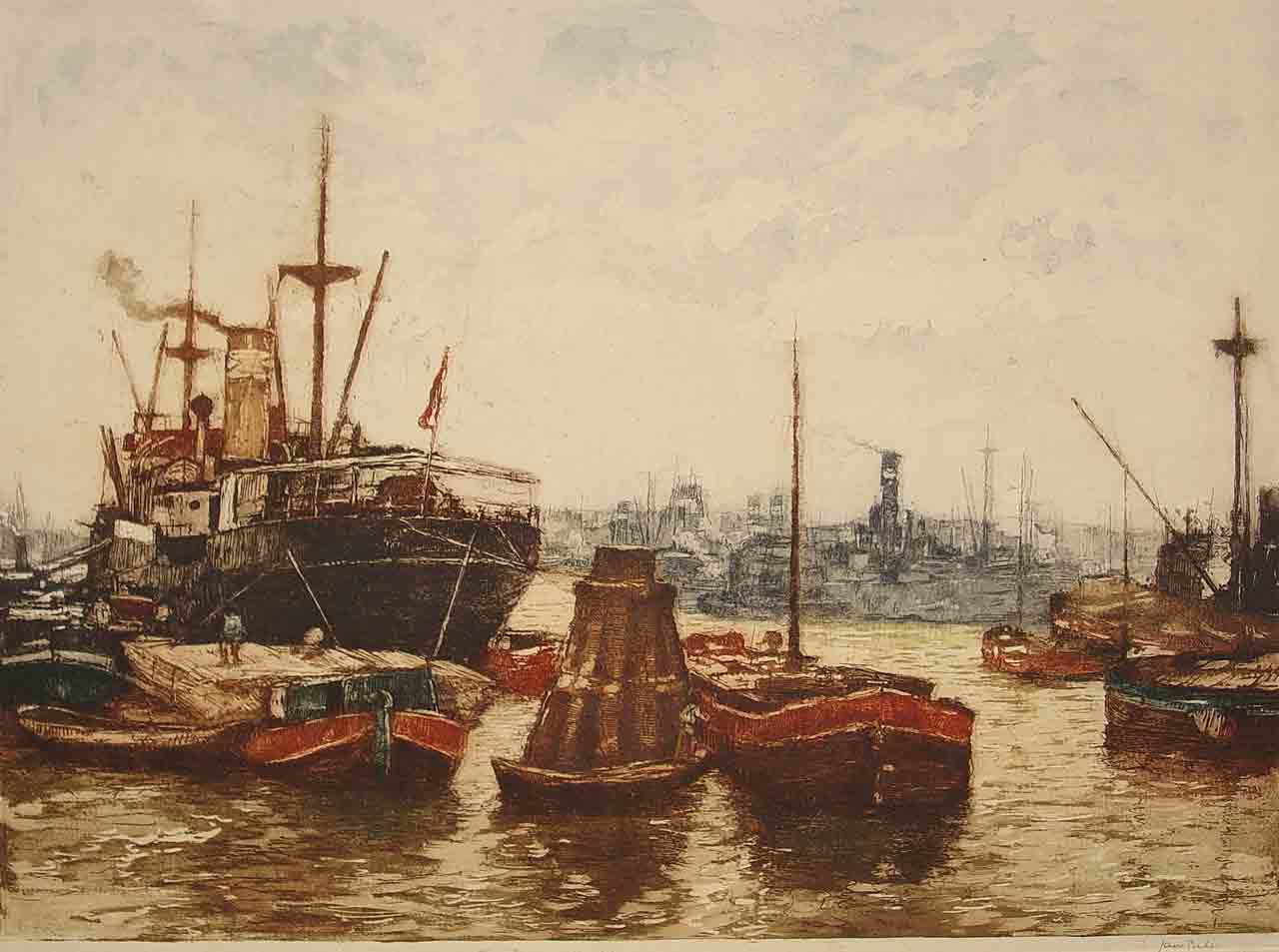
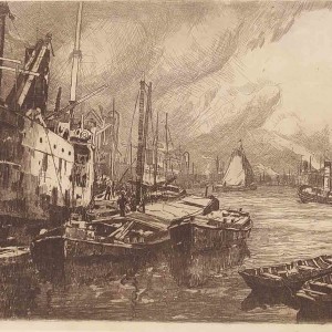
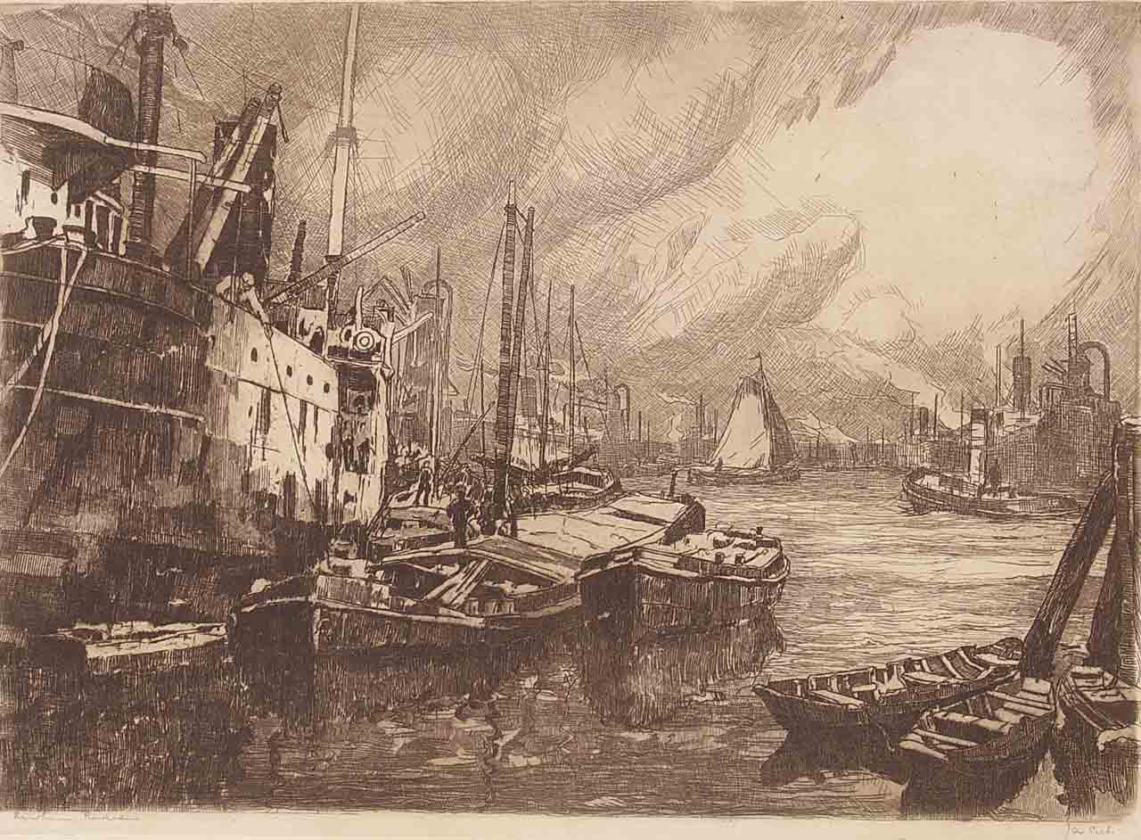
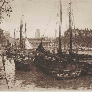
Jan works consistently in the Rhineharbour and in his large scale etchings he tells the active story of this busy transfer harbour where massive steel ships were off loaded whilst on anchor. During his time in London he creates large etchings around the Thames and Black Friars Bridge.
Sirks continues to draw the emphasis into the foreground with a darker tone and denser line. His aim is to portray reality in action, not a romantic vista.
Toward the end of this phase the vibrant green makes way for a blue-green hue when he paints London’s Southwark Cathedral (1928).
-
- Giethoorn c1926 30 x 40cm.
-
- Giethoorn Painting c 1926 30 x 40 cm.
-
- Southwark Cathedral London 1928 79 x 57cm.
-
- Rotterdam & Rhine Harbour 35 x 47 cm.
-
- Rotterdam Rhine Harbour 30 x 42cm.
1928-1932 Willows, Harbours, Cityscapes
This phase marks a time of tremendous social activity. Sirks becomes the first president of the Rotterdam Artists Society, assists with the establishment of Oasis,a society for artists,writers and takes the initiative for the Crisis Exhibition (Crisis Tentoonstelling 1932) that raised funds for artists affected by the Depression.
The palette of this time is illuminated rather than vibrant and the predominant choice of subject matter takes Sirks back to the farmland that surrounds Rotterdam. The brushstroke becomes finer and sees a increase in variation of tone and colour within each single stroke.
Sirks takes on several commercial commissions :Holland America Line,King’s Lyn Line, Dutch Olympic Committee.
-
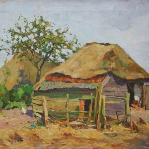
- Farm with cherry tree c1928 40 x 50cm.
-
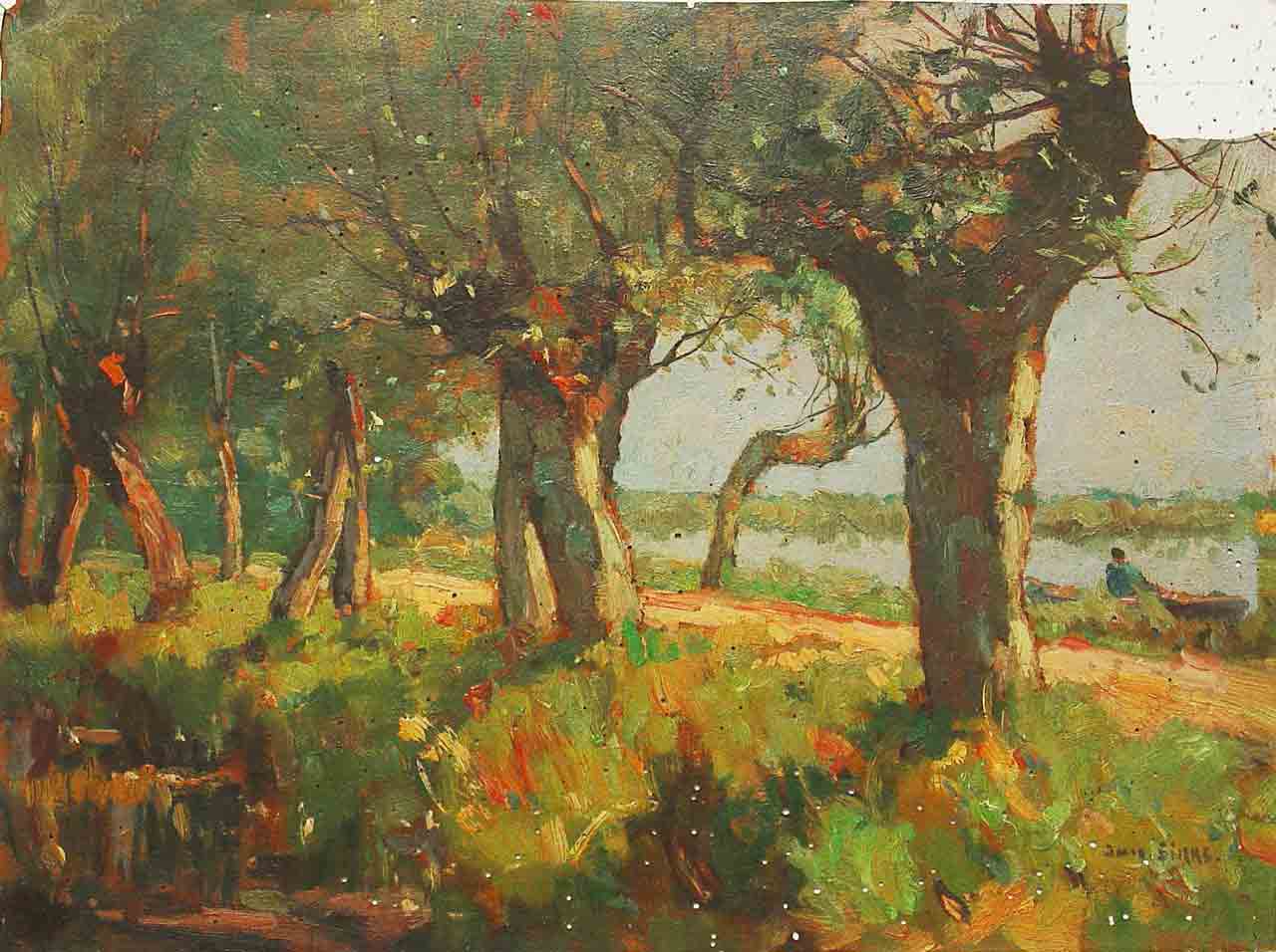
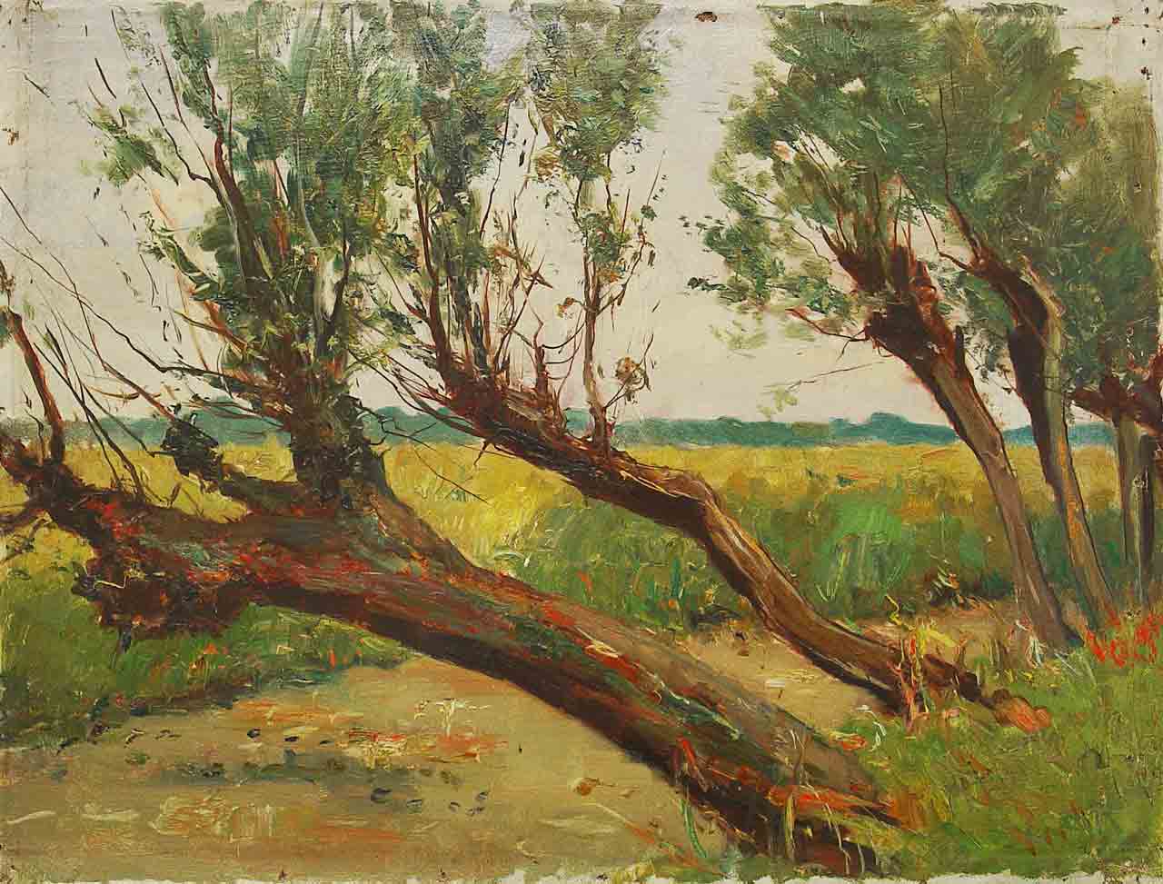
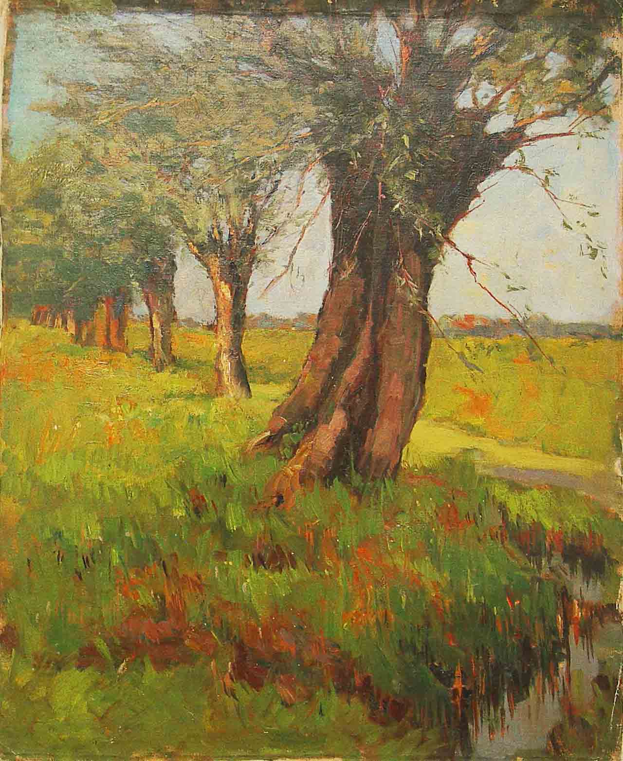
- Willow trees c1829 30 x 40cm.
-
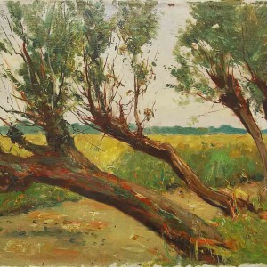
- Willow trees c1930 41 x 52cm.
-
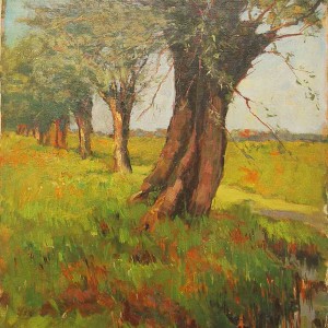
- Willows 1930 58 x 48cm.
-
- Rotterdam Leuvehaven 22 x 28cm.
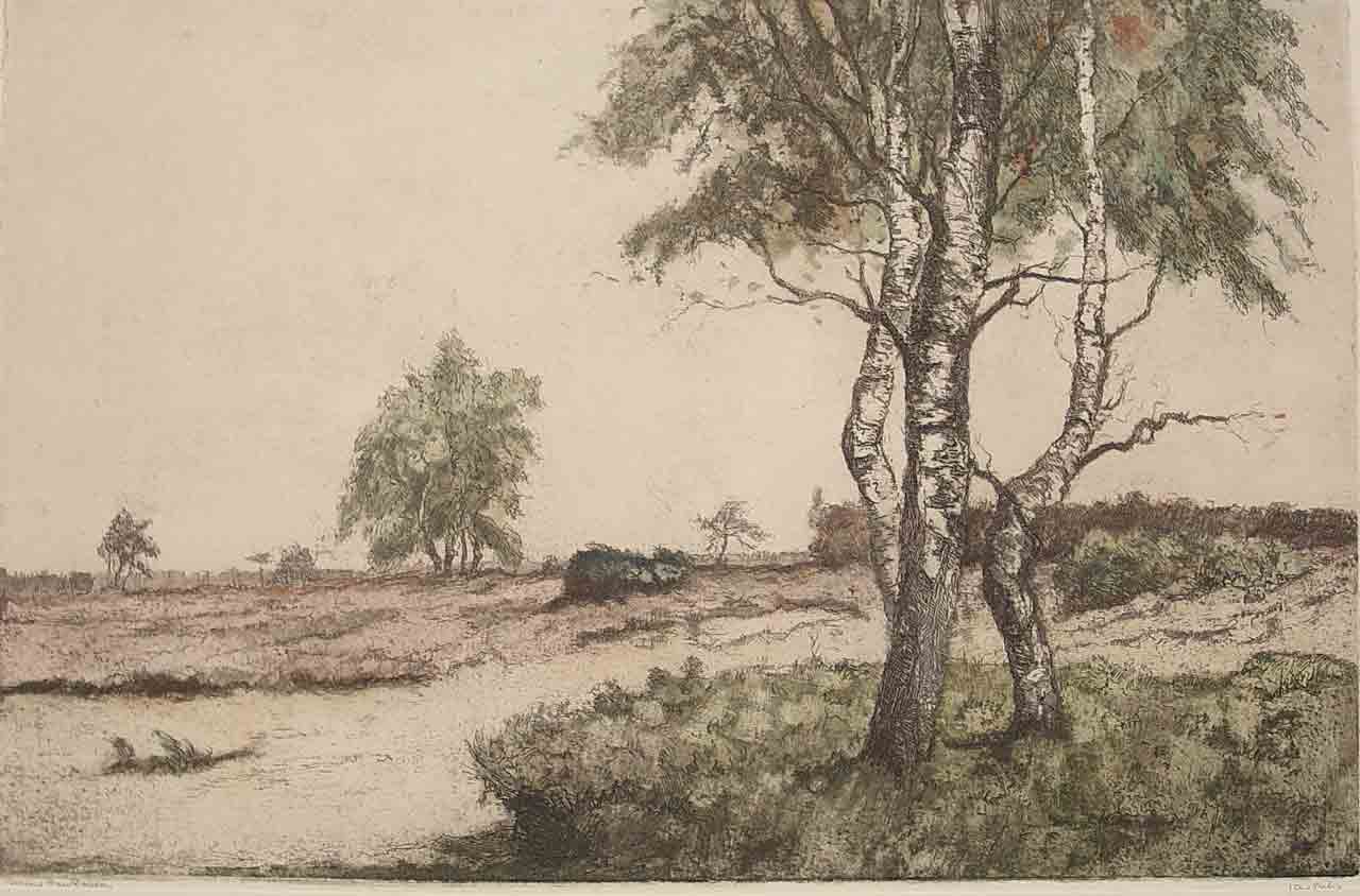
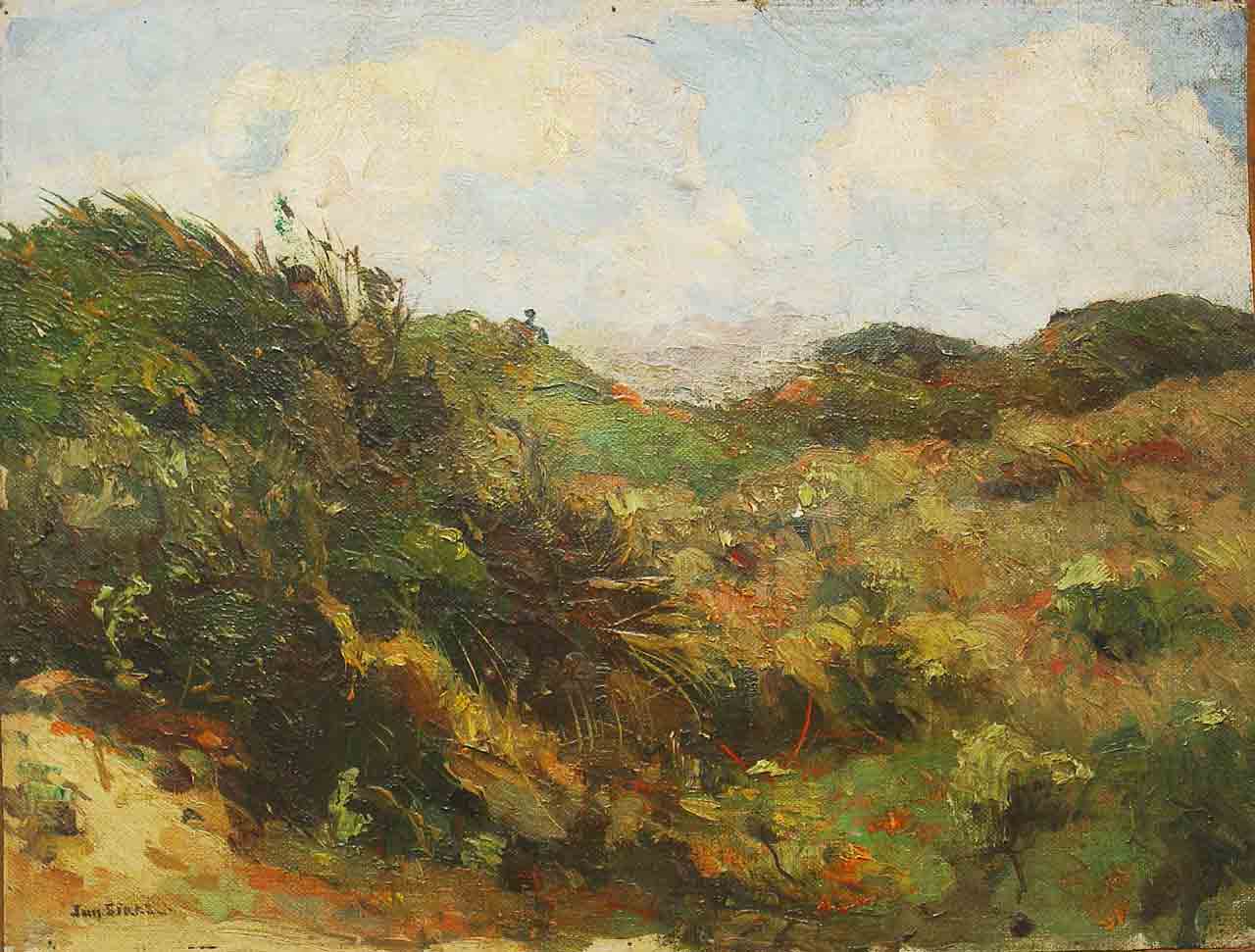
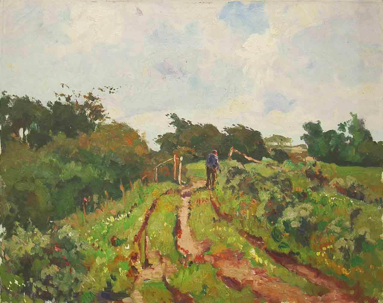
1933-1938 Mature Phase Solitude and isolation in coastal and forest landscapes
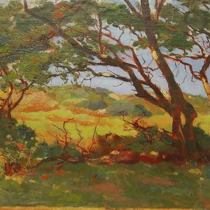
From 1933 onwards Sirks mostly leaves the city behind and travels extensively throughout the Netherlands. He captures forest and dune landscapes that lead into the infinite expanse of the infinity beyond.
Trees, particularly birches, and dunes feature majestically as they dominate the central foreground. Roads and tracks lead into infinity.
The larger scale landscapes are naturalistic in tone and composition with a fine and detailed brush stroke. The naturalistic palette enhances the still and contemplative quality of the works of this time. He captures the beauty of nature yet conveys a sense of isolation that is reflected increasingly more as Sirks’s health deteriorates.
-
- Birch trees in Dendolder 39 x 60cm.
-
- Coastal landscape 30 x 39cm.
-
- Farm landscape 46 x 58cm.
-
- Farm landscape 1936 24 x 34cm.
-
- Trees on the coast 29 x 49cm.